-

A Conveniently GONE user


 2022-06-16 10:36:07 UTC
 How’d you rate this? Harsh criticism is allowed since I want to be excellent at gradients.
Stick Nodes®
A stickfigure animation app created for mobile devices!
Create your own stickman animations on your Android or iOS device!
A Conveniently GONE user 2022-06-16 10:36:07 UTC
How’d you rate this? Harsh criticism is allowed since I want to be excellent at gradients.

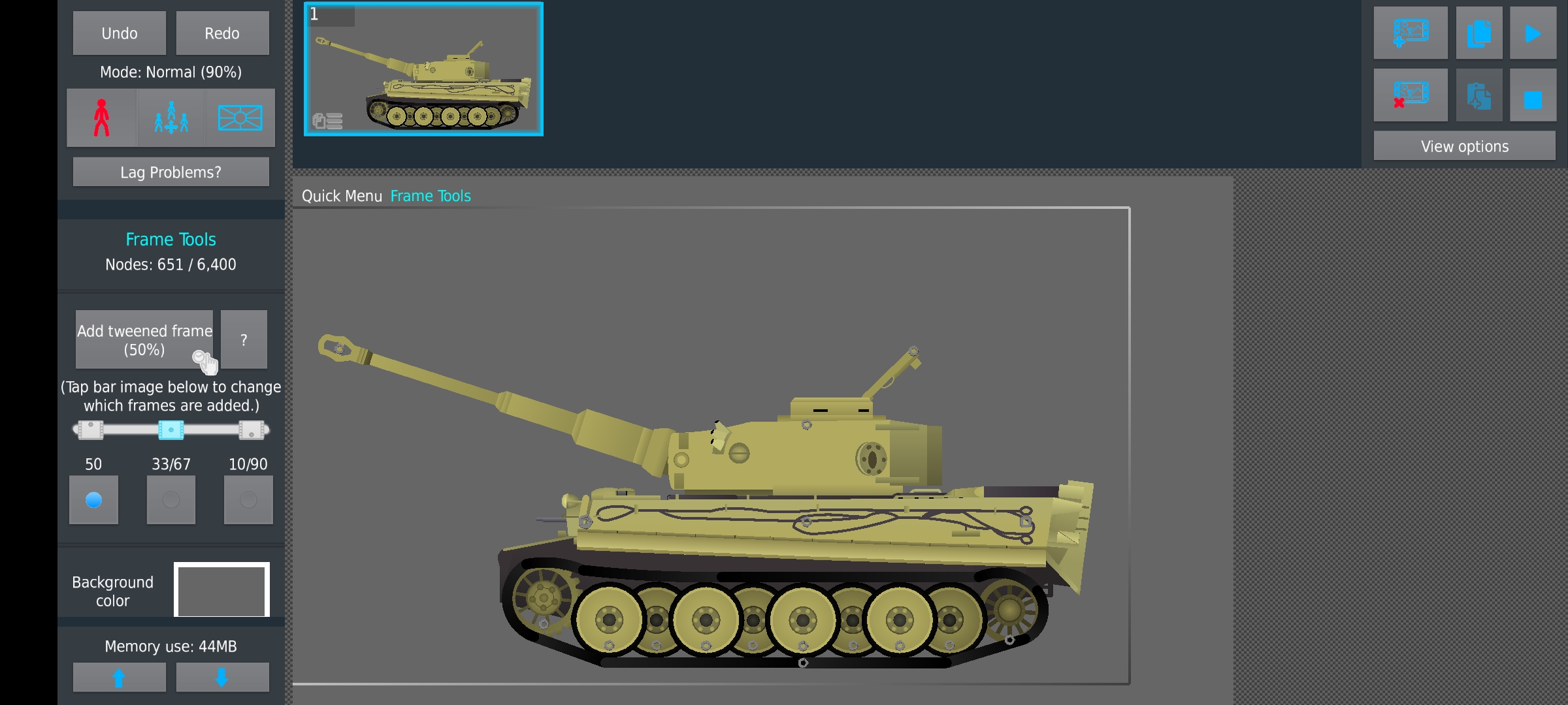
overall it looks really good, the “worst” parts are the black segments, because they clash so much with the generally otherwise neutral/desaturated grays you got going
they look out of place – the wheels for example, tone down the blackness (#cancelralph) so it blends with the other gray around it a bit better, same with the treads
Ah , gotcha let me fix the issue, I’ll mention you to see if I fixed the issue
That is a very nice tank, but perhaps make the gradients more subtle and don’t have opposite colors in them (Very dark color + very light color), generally for a decent gradient you need to make sure they mix well without disturbing the atmosphere of the figure. Otherwise this looks very nice, how many parts to assemble?
2 parts only.
You love to see it
What’s with the black scribble?
That’s how I role.
How everyone else fixes the issue: making the colors on the figure work better together
How I fix the issue: purposely keep the lighting mid and export a transparent image of the figure, and then add low-opacity paint on top of it in an image editing software, and some background stuff too. I swear that integrating other programs with Sticknodes makes for genuine better art.