@infuriator


Joined on July 13th, 2019, this user has been a member for 2,519 days and is the 22,117th person to register an account.
Has 25 submissions, the first one uploaded on July 14th, 2019 and the most recent on July 25th, 2022.
Of those, 1 has been featured and 9 have won Users' Choice.
On average, each submission earns 2,786 downloads.
In total, they have been download 72,442 times.
Counting every individual stickfigure, including the contents of all packs, this user has technically made and submitted 107 stickfigures.
On average, when this user rates stickfigures, they are 65% positive.
Also, they are typically 100% positive when rating animation spotlights.
Has made 151 comments on non-activity pages of the site. Alternatively, this user has made 543 comments on actual activity pages of the site.
This member is not a Users' Choice voter.
Show More


-
 Replying to comment by:
Plot twist it’s a boy ;-;
-
Replying to comment by:
Lol who knows
-
Replying to comment by:
Ok, btw what did I mess up
-
Replying to comment by:
I didn’t submit it yet, im making slight changes
-
Replying to comment by:
That’s basically what is I can’t make it more complex than this
-
Fantastic four series might be coming soon! 👏👏👏
-
Replying to comment by:
Ye
-
Who’s Excited for THOR LOVE AND THUNDER!!?? ;-;
-

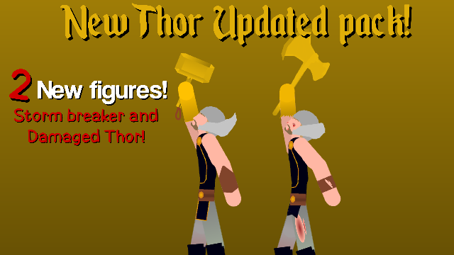
You should add more details for the gold instead of using one gradient, I can help you out if you want me to, just send it over to [email protected] and I will see what I can do from there.
-
Replying to:
I didn’t submit it yet, im making slight changes
-
Replying to:
Ok thats fine, Just know I still am here to help so the opportunity is still open. 👍
-
Replying to:
Ok, btw what did I mess up
-
Replying to:
The Gold on the hands, the battle damage is just an ellipse with red and it could use with a bit more detail, like I said i’m still willing to help out.
-
Replying to:
There’s not enough nodes to do all that, plus the rips looks just pretty good to me, i personally don’t care for the gold there’s no other way to make it better
-
Replying to:
There is a way to make it better, but forget it man I wont offer again, i’m guessing your happy with your design so I will leave it at that.
-
Replying to:
I am proud of my work, I guess I’ll tweak the rips out alil bit but overall I’m happy, I rushed when I made this too, it only took about 30 minutes
-
Replying to:
Ok 👍
-
Replying to:
What do I have to change with the gold? I don’t get it
-
Replying to:
Just work on the shines etc. That sort of good stuff, try getting some colour palettes online, some references for his glove, otherwise it just looks a bit plain and boring, also I would work on the helmet detail etc.
-
Replying to:
Idk about the helmet, because there is not enough nodes
-
Replying to:
Oof
-
Replying to:
I can’t do it to many nodes
-
-
-
-
-
-
-
-
-
-
-
-
-
-
Replying to comment by:
I thinks gonna be great only cuz it\’s not part of the dceu, what a disappointment
-
Replying to comment by:
Thanks
-
Replying to comment by:
It\’s focusing on all the avnegers and thier adventures like with, fantastic four in probably 1 ep and like hulk vs the avengers, and there will be a reboot after 5 ep and there will be season 2
-
Replying to comment by:
I\’m uploading a new thor pack with different versions of the one I made, will come with mjolnir like the other one
-
Replying to comment by:
Np, most of the series is gonna be u and my stick figs, and im gonna shout you out at the end of each episode
-
Replying to comment by:
Uthats just a fun poster of Thor it\’s not the poster of the series
-
Replying to comment by:
Oh, I didn\’t make the clouds, but if your talking about how I put them together then ty
- Load More


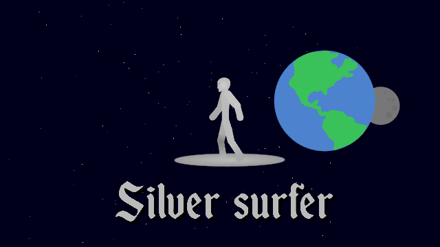
looks like a nude dude with an ellipse glued to his feet
That’s basically what is I can’t make it more complex than this
ah
👌
That looks like those ads, were the asian Girls are painted in gold and the shit goes down from that. But this one is silver
Plot twist it’s a boy ;-;
hm
i didn’t know they were marvel until now
FANTASTIC FOUR VS THANOS WHEN
Lol who knows