
-
MannyAnims


 2023-05-06 23:10:24 UTC
 I downgraded the Sticknodes app
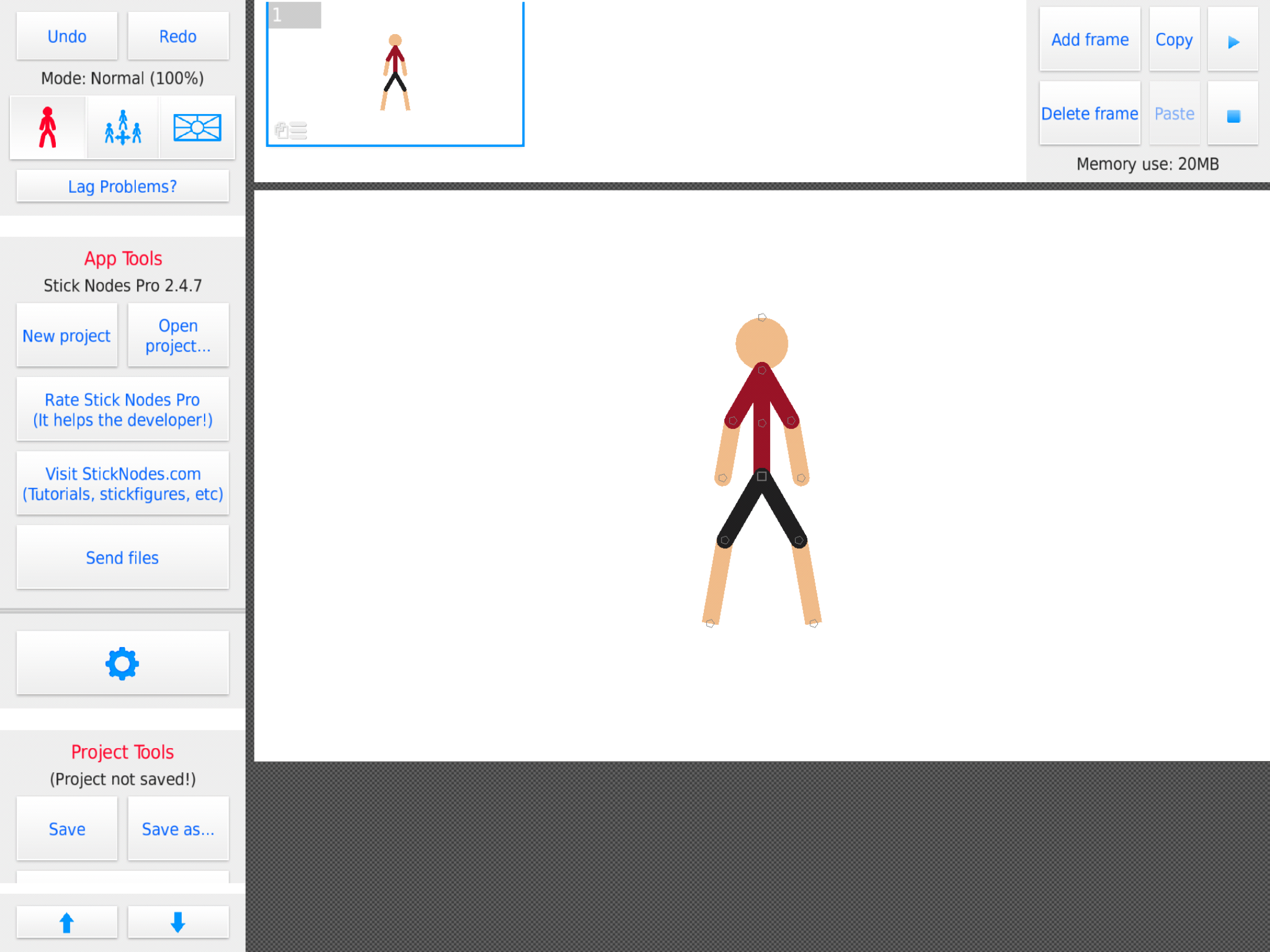
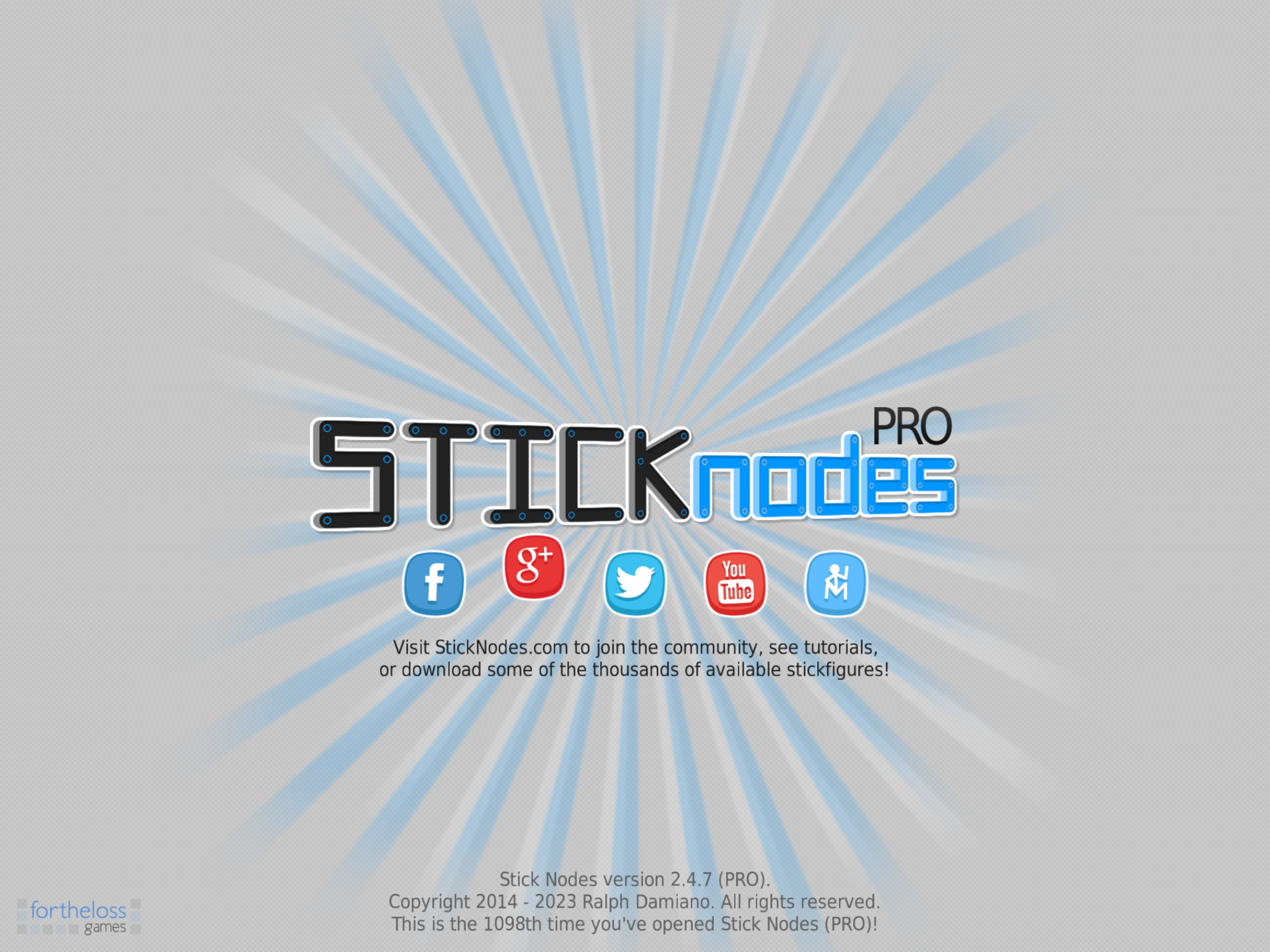
It has a certain charm to it, but overall it feels weird to use and is ugly compared to the newer versions, still cool to see how it used to be though
Stick Nodes®
A stickfigure animation app created for mobile devices!
Create your own stickman animations on your Android or iOS device!


charm is a potential word to use, yes
im actually tryna get 1.0.0 to not clash with existing installed SN so i can distribute it for the lols
Also why is your brand or whatever it is called “Fortheloss games”, when you never published a single game under that name
he was going to but then stickfigure
Default seduced him
mf i made numerous games https://fortheloss.org/games/
Oh
There weren’t any on the App Store, but I forgot Android exists.
IOS for life! (Well, in terms hardware [on tablets, at least], android has better software due to them limiting you less)
Also finish hero dude
I dare you
lmao
I prefer the older one, the one above yeah
It’s just cleaner, not as cluttered looking and as for splash screen etc there could’ve been a more creative approach to include them while keeping things clean.
Interesting, I never really thought of the current UI as cluttered, though I do admit it can be hard to find things sometimes due to the amount of buttons available
Yet again, I never had anything to compare it to (until now)
I was referring to the opening screen alone, the UI has remained consistent since around 2.0.0 or near there.
I see, that makes more sense
oof
just wait til 4.0.0
there’s more to the new splash screen than just new characters >____>
Nice, the current design isn’t bad but I’m just saying it could use some work maybe. For me personally I’m not a big fan of it but of course that’s just my opinion so no offence of course.