
-

'Narra (WC 2025) | ON HIATUS

 2024-05-26 04:13:28 UTC
 @ralph YOOOOHOHOOOOOO
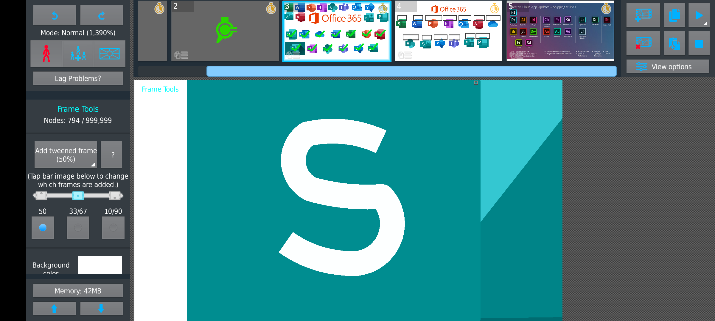
I made an S that is SOOO much better than the one seen on Sway & SharePoint!
While it’s not perfect, it’s a 60% increase in accuracy for sure.
Stick Nodes®
A stickfigure animation app created for mobile devices!
Create your own stickman animations on your Android or iOS device!


I dont think ralph cares about an S
your S looks like ricky berwick
💀 real
Use an actual text font S, then trace it or either use it as reference.
👍 might do that, as I plan on making an alphabet soon. (I hate seeing ppl use those shitty old letters on all these figures)
Using Old Letters?
I mean the bad looking ones, I see them on almost every fig that has letters. Look up John Deere on figures & find the excavator, the letters suck ass 💀
Why those specifically though?
Eh, just the ones I could think of immediately. There’s dozens more figs I’ve seen with that type of style.
Also, they’re all wonky & different size, not to mention just look messy
I guess so