-
████████ ██


 2022-08-21 00:59:14 UTC
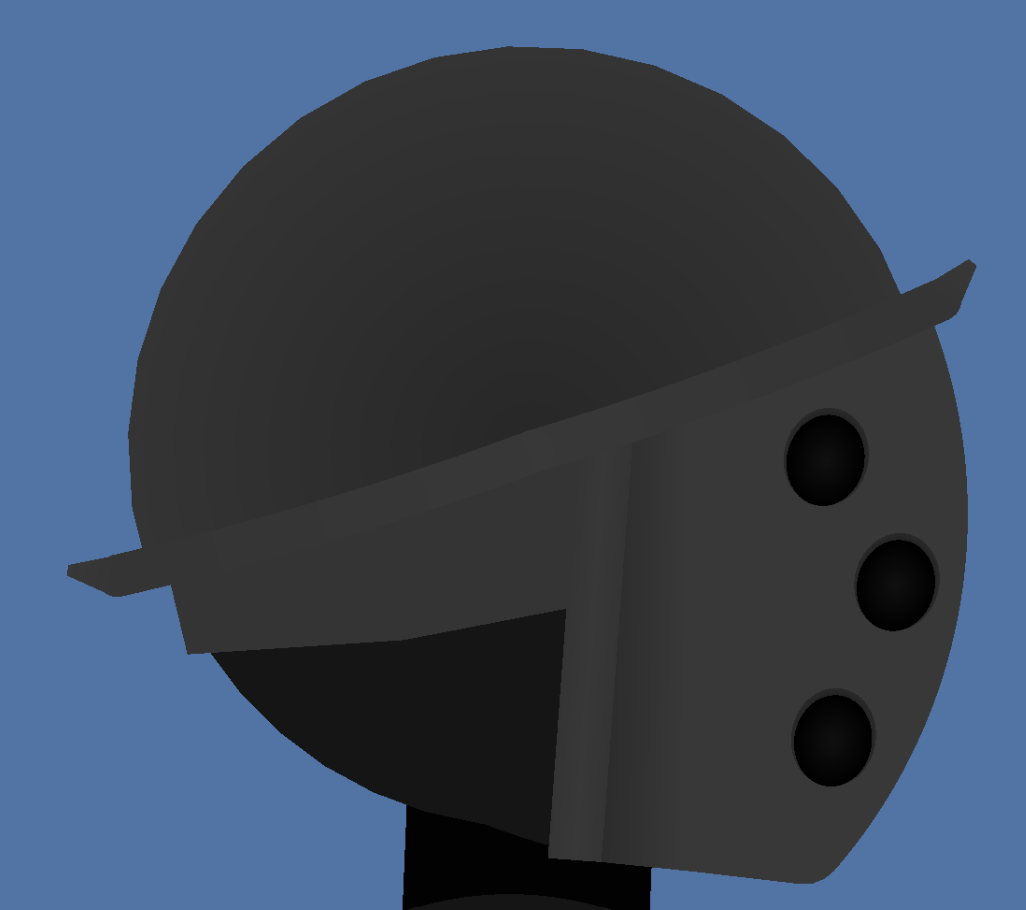
 someone help me identify what’s wrong here.
cause it feels like it looks wrong.
but I truly got nothing here
Stick Nodes®
A stickfigure animation app created for mobile devices!
Create your own stickman animations on your Android or iOS device!
████████ ██ 2022-08-21 00:59:14 UTC
someone help me identify what’s wrong here.
cause it feels like it looks wrong.
but I truly got nothing here

I feel like in proportion to the head the top ‘dish’ part should be bigger and cover more of the front of the helmet and head like what you’ve got in your Heroforge designs but maybe smaller than that.
Adding some slight colour possibly of red to the metal or at least the shadows could make it pop more but might not be as realistic.
is it alright if I contact you on discord for more feedback on this advice I’m implementing?
Go ahead
check dms 🙂