-
Delo


 2022-01-06 22:20:50 UTC
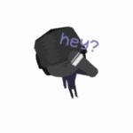
Sneak peek
Also the new villain is gonna be king pin cuz Marc Spector is a hit man for king pin in my series
So he goes against some of the Sinster 6 ppl
Stick Nodes®
A stickfigure animation app created for mobile devices!
Create your own stickman animations on your Android or iOS device!


epic
This is why your a mod
Always giving positive feed back
I mean, constructive feedback will always be more valuable than purely positive feedback. You’ll never do more right if you don’t know what you’re doing wrong
My thoughts exactly, helpful critics are better than yes-men lmao.
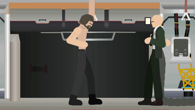
I suggest when the doc Oc dude points his arm I kind of looks wonky cuz it stops so just tween between the frames so it will look more natural
Scorpion… and it’s a threat ig idk and I don’t use tween
Also easy fix I made a frame were the tail was to close together
Fixed
Cool
The way scorpion moves his tail, but the rest of his body is still is a tad wonky, and it doesn’t really look like a threat it sorta looks like he poked him
Maybe to have it be that way, sorta have him get up close to him with the tail right below his chin, instead of him like flopping it next to him
and also have the camera close up on him, not giving much breathing room as that signals he’s being threatened and doesn’t have the platform to really combat it
The text is placed in a weird spot, I think it might look better if it was near the characters heads
The Egypt text is fine where it is though
When doing talking scenes, try having the characters do little movements
It really helps out imo
Some of the things I do like are the figures, and backgrounds and such
The animation can use work
Otherwise it’s decent
6.5/10
I think with practice you can get good at this, you’re already pretty decent
This isn’t meant to be rude, I’m just tryna help you improve
Wow, how I didn’t see this. It’s great, and I think using Scorpion is pretty good if you need several of Spider-Man’s villains let me know, I have many designs