It’s too simple, the flashy design of StickNodes makes it super neato and also shows off our icon stickfigure rather than trying to be flash/Adobe Animate/autism aka Pivot
Replying to:UnknownIt's too simple, the flashy design of StickNodes makes it s
that icon as it is now, I have to say, I still like it to this day
which is unusual when it comes to art and stuff like that, look at the website for example, I keep adding and tweaking things to this day because I don’t like how things look after some time, same with the app and it’s layout, etc…


meh, i know im not ralph but me no fan 3:
Yeet, I agree. I should add more contrast
User Banned
It’s too simple, the flashy design of StickNodes makes it super neato and also shows off our icon stickfigure rather than trying to be flash/Adobe Animate/autism aka Pivot
Well, I’m trying to make it so it’s keep up with the trend where people use gradients and gylphs
Keeping**
User Banned
I think StickNodes’ App icon looks good as it is because it’s unique, you can immediately tell it’s SN rather than something like *gags* Pivot
Yeah I think the current one is unique, like I said… this was only for one
Fun**
User Banned
No, One
No, uno
User Banned
*Que ad for Uno Board game in Spanish*
I blame the Spanish Inquisition
User Banned
NOBODY EXPECTS THE SPANISH INQUISITION
EXACTLY
that icon as it is now, I have to say, I still like it to this day
which is unusual when it comes to art and stuff like that, look at the website for example, I keep adding and tweaking things to this day because I don’t like how things look after some time, same with the app and it’s layout, etc…
but this icon
it has withstood the test of time
and at this point it’s become a good symbol of the app, I wouldn’t change it even if I wanted to
same with the default stick
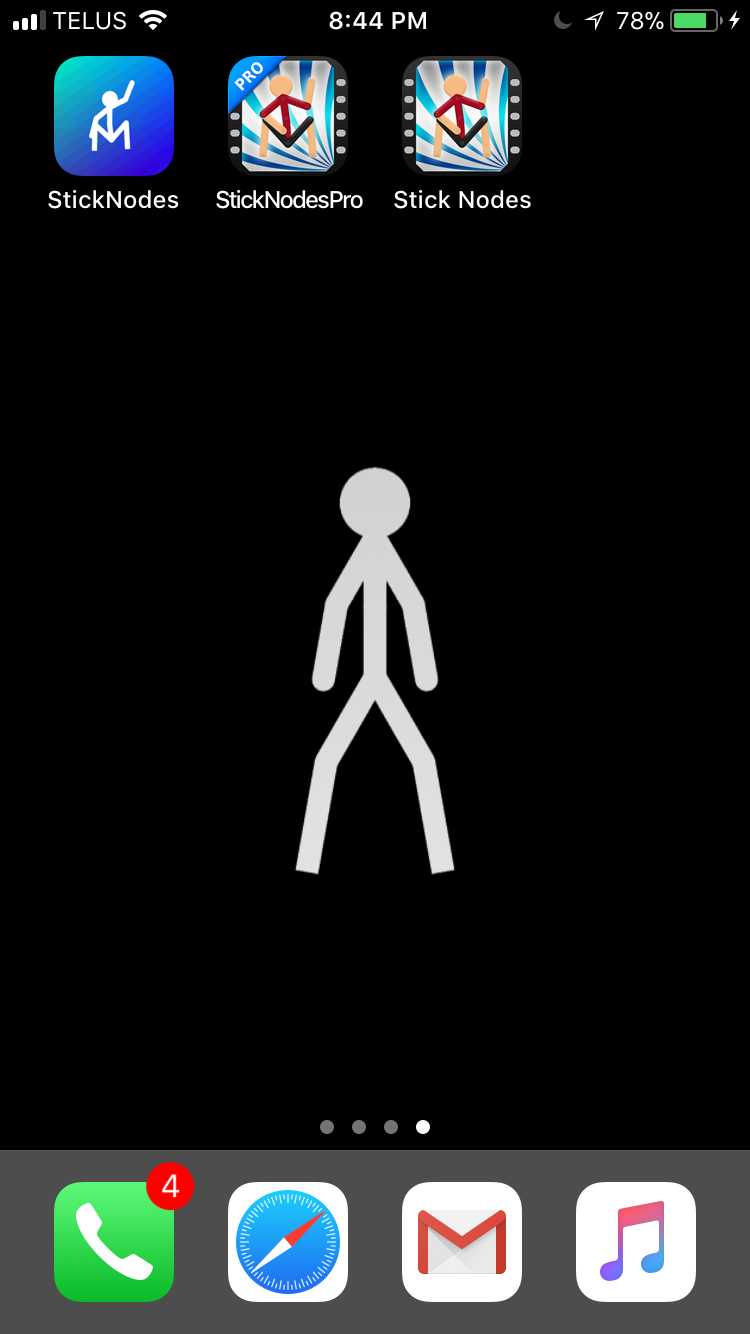
I like your wallpaper though 11/10