-

Largest guy 65


 2022-05-16 12:20:11 UTC
 Should I stick with the embroidery or scrap it?
Because I think it’s garbage but I don’t want to delete the fig and learn that someone might actually prefer it
Stick Nodes®
A stickfigure animation app created for mobile devices!
Create your own stickman animations on your Android or iOS device!

Get Redhood to do it for you

You misunderstand my friend, I want the fig to improve in quality, not look like a crayon drawing that got left in the rain
I didn’t say Nicky
Neither did I, but I know I’d damn sure take his help over red hood’s.
I didn’t know we were in 2018 still
No one said we were, and that doesn’t even make sense since Nicky didn’t really start making good figs until like early 2019. And I don’t even know why you are deflecting this to Redhood and Nicky because I was asking what people thought of the fig and how I, myself alone, could improve the fig.
🤓
Thank you Gigan, truly insightful.
Now is that all you had to contribute to my inquiry or do you have actual advice that could improve the fig?
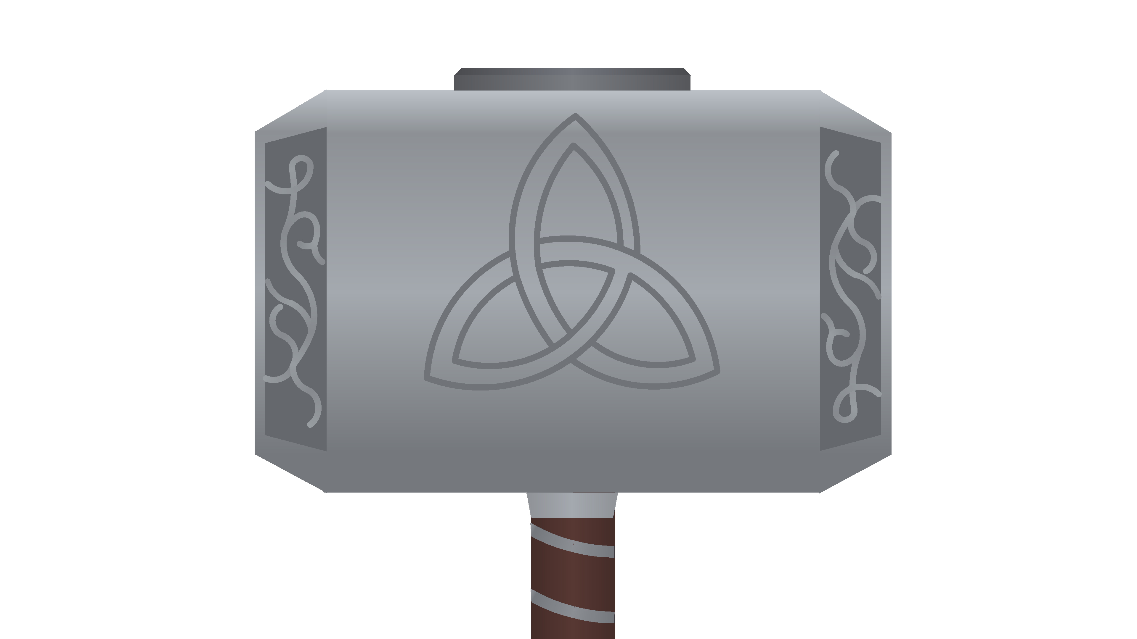
The sides and top Are of a darker variety of grey , contrasting in such way due to their angular differences
While your figure does have the gradient part semi done , it looks more like a flat sheet of metal in contrast to edged and contrasted sides
Probably stabilize what colors you’re gonna use for the ends of the gradient coloring
Secondly , use a more sleek basis for the lengths and widths of the round segments you used for the symbols
While round segments alone are childish at best in this situation (I’d personally mix them with mainly the use of shapes to convey the way the embroils glare
Guessing since you’re not gonna try to grow out do that , thinning and thickening the lines accordingly to the hammer’s actual design would help
Finally , redo the handle completely
Its archaically made , especially for someone as supposedly great as you , don’t just reply on the dullest methods possible to convey your figure
Spice shit up with other shapes and methods
Lmao I never described myself as great, far from it actually, but I will definitely take your advice and ‘spice shit up’
You know what I meant you insufferably delusional cum leech
I’ll make you a bet. If you can find one quote of me saying I’m great or calling myself an amazing fig maker or anything like that, and not me making a joke or being ironic; I will delete my entire sticknodes account and just stop. How ’bout it?
Also nothing before like June 2020 because I acknowledge that everything said before that time was by a delusional psychopath with a warped perception of hisself.
Nigga it was a fucking joke
Why is your fucking pussy so sensitive about this shit anyways
I just made a bet because it would be fun.
Anyways we’ve hit the 24 hour threshold of this argument, so I don’t really care much about what happens in it so I’m out
I have your nudes
You fucking hit him with facts when he asked for facts
That is a fact technically
I asked for advice and he gave advice
I don’t really know why you said it like that though.
Because he thinks you’re vermin
Ah that’s why. That checks out.
Ah, cry about it or something-
Wasn’t planning on it but that riveting speech has changed my mind. Truly a shakespearean level piece of literature. Just absolutely breathtaking, almost as interesting as Hamlet. You make the bible seem like a picturebook. Magnifìcent. It makes Romeo seem like an enjoyable character.
god your unfunny
Yeah I see what you mean I’ll use more shapes in the embroidery. That would definitely make it look better and save the node count a bit, thanks
Thank you, I’d make the embroidery more accurate but that would nuke the node count so I will probably just add a bit more
Hence why you should make it with shapes
As I said , 2018 vibes with the lot of you all
While the excuse of this possibly being a quick figure or whatever , it still doesn’t take away that you’ve stagnated long enough to be overshadowed by many young users
Figures like by Robert are good examples of better methods being used


While his character figures may not be the best , don’t be a retard and ignore his style