@gyro


Joined on October 21st, 2017, this user has been a member for 3,165 days and is the 3,482nd person to register an account.
Has 61 submissions, the first one uploaded on December 22nd, 2014 and the most recent on October 1st, 2024.
Of those, 3 have been featured and 12 have won Users' Choice.
On average, each submission earns 3,771 downloads.
In total, they have been download 230,046 times.
Counting every individual stickfigure, including the contents of all packs, this user has technically made and submitted 244 stickfigures.
On average, when this user rates stickfigures, they are 99% positive.
Also, they are typically 100% positive when rating animation spotlights.
Has made 221 comments on non-activity pages of the site. Alternatively, this user has made 3,084 comments on actual activity pages of the site.
This user also has been featured in the Animation Spotlights 2 times.
This member is a Users' Choice voter!
Their current voting streak is 0 and their longest streak is 5 consecutive votes.


-
OK.
I recently was talking with @speruu about character design and criticism on a post made by @deananims showing off his honestly not-that-good RHG.
In this conversation and the multiple conversations I’ve had with Dean, Esperuu, @ramoxfire1 , and @epitaph200 , I think good character design is the first thing you should worry about when making your character
“Write your character” -Solar Sands, You should really check em’ out.
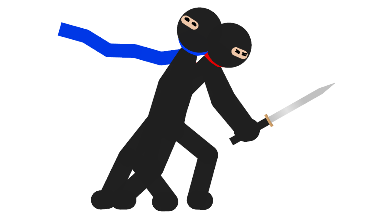
Now I quickly whipped up these three GIFs, containing characters I’m not that proud of, and are pretty mediocre, but that’s not the point OK EPITAPH?!
It’s to show how character design can be EZ PZ.
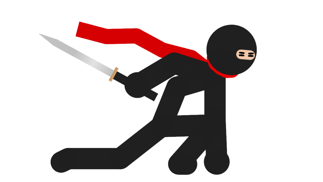
Look at the Red ninja, You can tell he’s a ninja just by his black outfit and iconic eye slot.
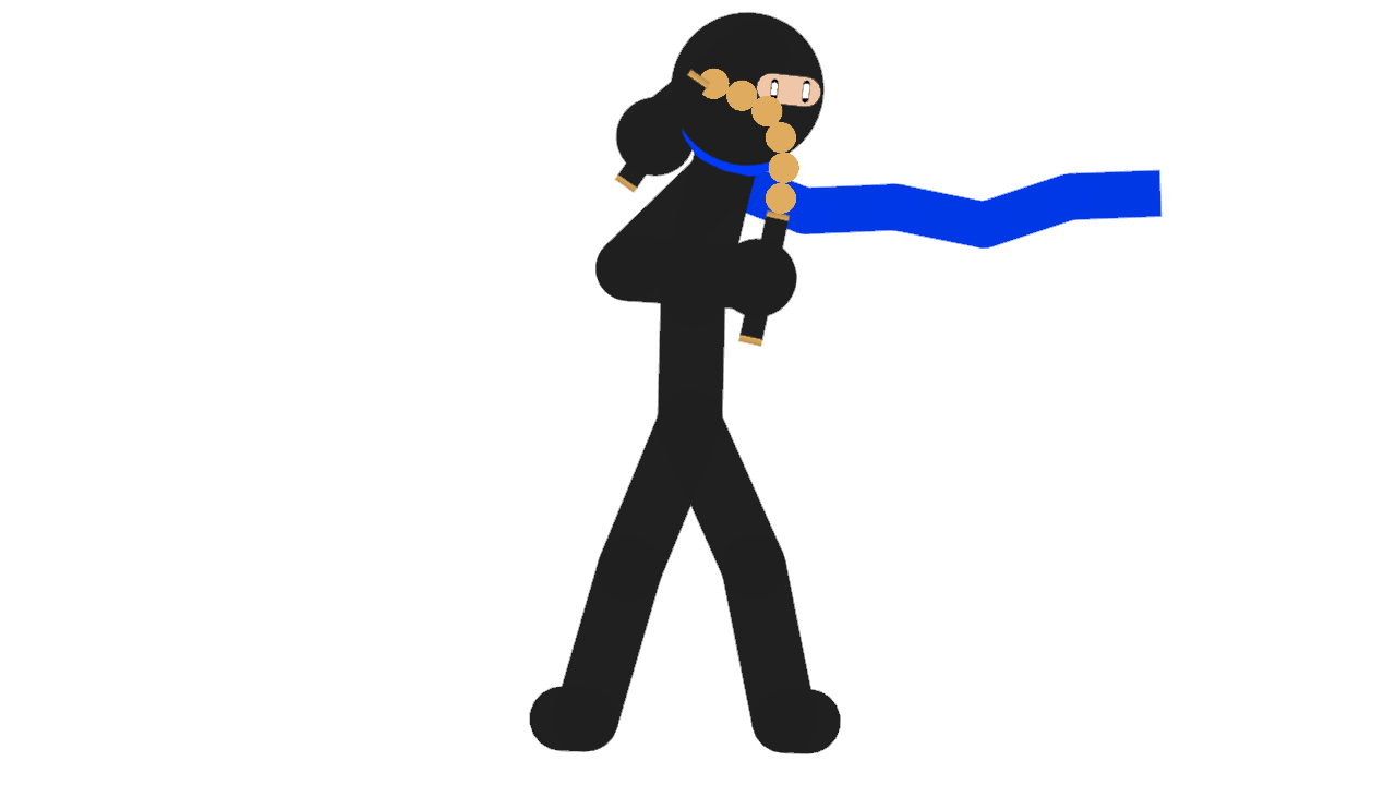
Look he even has a scarf, which is there to add color. COLOR. Something that is taken forgranted in most designs. Colors can say alot about your character, I chose red to be his highlight because red means blood, it means sex, it means seriousness, it means violence, which perfectly tells you this guy is serious, the point of which is reinforced by his posture and expression, an expression of coldness, and readyiness, prepared to strike at anytime.Then look at Blue ninja
You already know he’s a ninja blah blah blah.
This ninja is made to contrast with Red Ninja, not only because he’s blue but because he’s not serious.
You can tell by his wide eyes, stupid-cliche movie pose, and blue scarf, because blue means chill, it means relax, it means take it slow, which perfectly describes his attitude.
And then you put them together, and you can see what kind of dynamic is going on there, THAT IS GOOD CHARACTER DESIGN. Sure it isn’t the most memorable design, but it’s a good design non the less!
I just wanted to make this post so people understand what good character design is.
And I’m probably not gonna use these much.
-
@ralph I got a idea for a simple feature idea, and I\’ll pitch it despite the picture in the top right corner.
What about a limited Modify Branch button in Animation mode?
-

it probably will happen, for things that are editable in Animation mode (so can’t change things like static/draw order, etc)
eventually
2018-08-23 12:01:51 UTC
-
 Replying to comment by:
Thanos was the good guy the whole time
-
Replying to comment by:
No problem
-
Replying to comment by:
Also this IS the result of adding what he wanted to add, and it wasn\’t much
Now I don\’t have ANY problem with simplicity, but this doesn\’t convey anything
This definitely won\’t be getting you anywhere in the Animation/Film industry
And now, maybe you don\’t plan to be professional and just wanna do it as a hobby, ok sure. Still doesn\’t forbid you from criticism tho.
And maybe you\’re doing it JUST for fun, and ok, if you don\’t have fun with your hobby what\’s the point of doing it? But listen up
If you are doing it solely for fun and don\’t wanna get judged
Don\’t post it publically
because when you do it becomes public domain, free for the criticizing
-
Replying to comment by:
I think it was because Gmail TECHNICALLY isn\’t allowed on Amazon.
Technically the Android appstore isn\’t allowed
but that didn\’t stop me
-
Replying to comment by:
And even then, those were suggestions
-
Replying to comment by:
You see, sometimes you want to add alot of stuff
If you just added what you wanted to add you\’d get a mess
There needs to be focus
-
Replying to comment by:
When it comes to character design, a common misconception is that it\’s ALL about detail, but it\’s not.
You just need to convey the character.
You can have your character be naked, just have their body shape, posture, and demeanor demonstrate their character.
Look at Randal from Monsters INC
There\’s barely anything on this guy, but just from his body shape demeanor and expression gives you the impression this a slimey, slithery, cold-blooded, lizard creep, WHICH IS EXACTLY HIS CHARACTER.
The point being, detail isn\’t EVERYTHING when it comes the character design, but you do need to carefully plan your character in any situation.
-
Replying to comment by:
Fact*
-
Replying to comment by:
You need to have more focus on character design.
Now what is character design?
A lot of people have different definitions, but the definition used by most professionals define ‘good’ character design as “A design that can swiftly and simply tell you about your character”
Basically, you need your audience to know what a character’s about at a glance, but you don’t really get that with this figure.
Try focusing on the fight that this guy (According to the last time you posted this guy) is a delinquent who loves picking fights.
Maybe give him a bat
Maybe adding a jacket on his shoulders, anime style
But I’m just spit balling here
You can come up with more creative things than this I assure you
-
Replying to comment by:
I’m using Outlook now and it says it’s sent, do you have it?
-
Replying to comment by:
Yeah.
When I sent submissions, the draft would just disappear in my email app.
Nothing in drafts
Nothing in outbox
Nothing in sent
So I downloaded a different email app and will see if that works
-
Replying to comment by:
👌
-
Replying to comment by:
Pivot? I believe you misspelled “Dead”
- Load More


Interesting
However I don’t think you will get through to epitaph with a scarf figure
User Banned
you make good points but your examples are not good.
you forget the other parts of character design, namely avoiding 1 dimensional characters. while you can definitely tell he’s a ninja, that’s it. if i were to say one of these ninja’s was a timid farmer and the other a rebel soldier, you’d never be able to tell. that’s why you develop your design, it makes them deeper and more interesting rather than some cardboard cutout like most Scarf User’s RHGs.
you also completely miss the point about generic and overused ideas. the character’s designs are VERY over done and will lead to confusion and to your work never standing out, your work will be for nothing, it’s why Apple phones look different to Samsung phones, they’re trying to stand out.
nice nice
User Banned
this is my point.
contrary to popular belief, i like simple designs, take this one for example
the thing is is that i like simple but not bland like your examples. this kid’s from RiME and is a perfect example of simple yet detailed. he’s simply this kid with a rag, scarf/cape and a bag, nothing much else. however, these few things tell you a lot about the character.
the rag is not in good condition, his clothes are low quality, his skin colour is brown, he’s quite young, it can all point to different character qualities.
the ninjas on the other hand have a scarf, eye slit and a katana.
the eye slit shows it’s a ninja, the scarf shows it’s a ninja and the katana is pretty much the only good symbol as it shows the region, the east.
do you understand now?
YES, but I wasn’t really trying to show brilliant design, more like mediocre at best surface design to show how design isn’t this hard thing that a lot of people think it is, great to have your opinion!
User Banned
your example was below mediocre, that’s the problem.
User Banned
i understand character design is complicated but if you aren’t willing to listen, you’ll never learn it.
to those who have listened, they’ve succeeded massively, take TheGamerX for example
YES I do understand character design, I’m just making a quick and easy example with little thought put behind it, yes I probably could come up with better examples, but I just wanted to get this down.