-

Tastylemon16


 2023-09-12 13:45:37 UTC
 SNU Groups currently under management and so I’m just going to post this here.
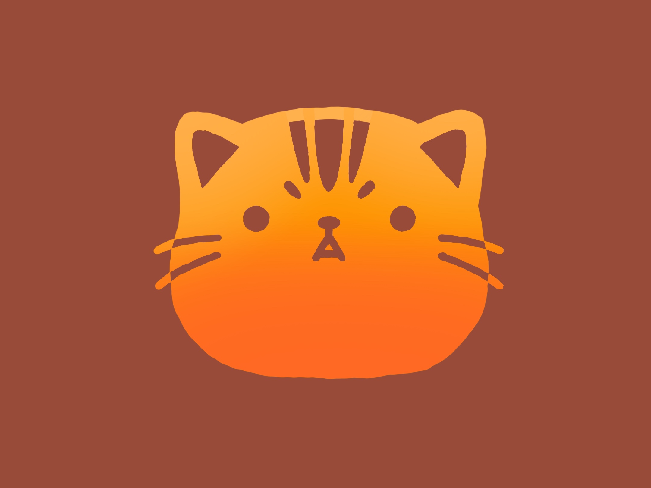
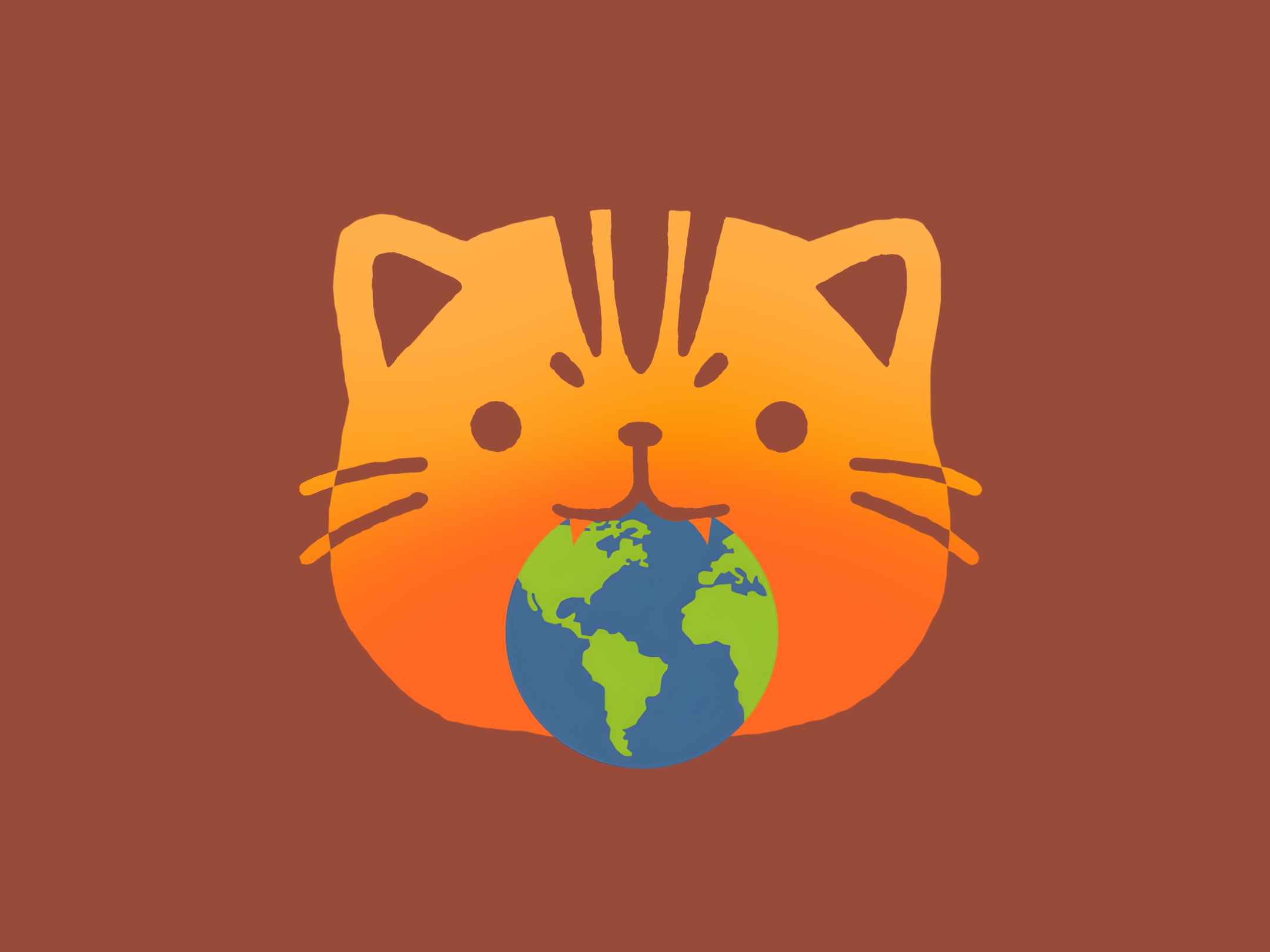
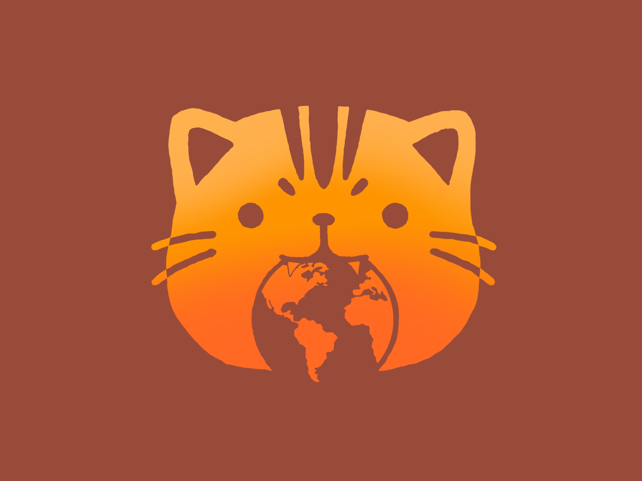
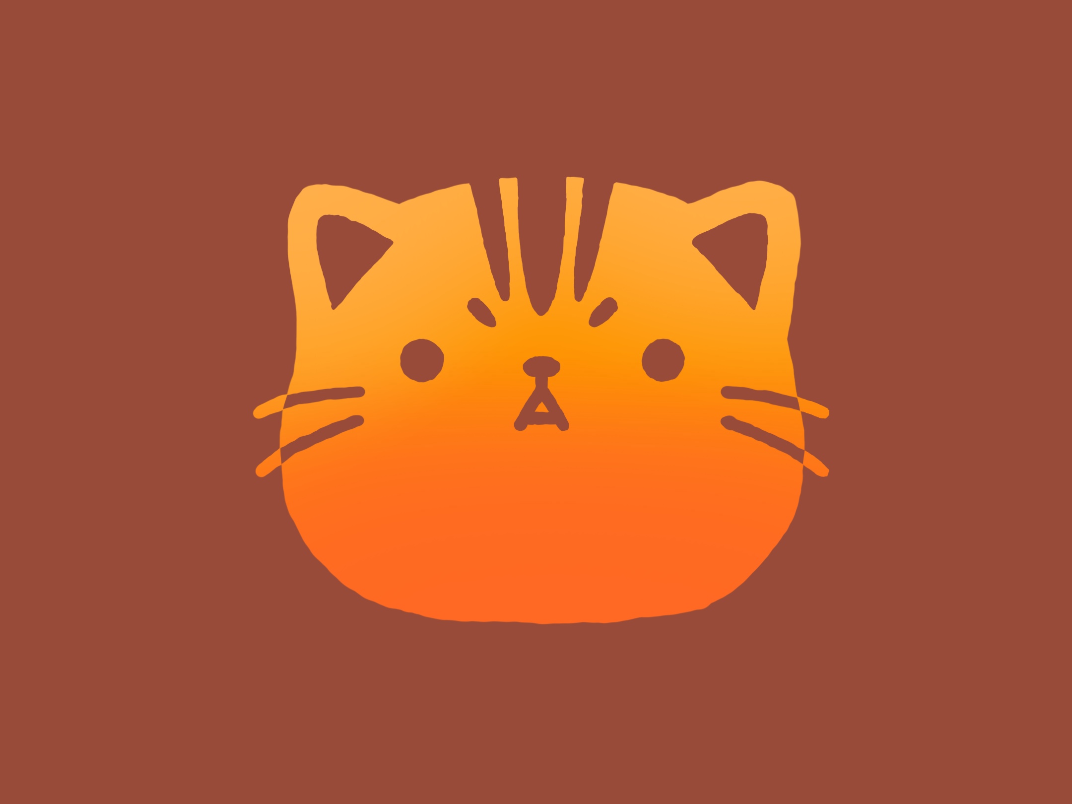
I thought I’d add a little something to the deficit in content for however long it’s been and get your thoughts and opinions on some designs for ‘ Lulu’s Restaurant ‘. This location has been for consideration for well over 2 years now and currently to get the ball rolling we’re deciding on a logo to use for it, let me know which one you like best, top to bottom, 1 – 5, which is your favourite?
( If you have any suggestions whatsoever I’d love to hear them as well as maybe why you choose to pick your selection of logo )

Stick Nodes®
A stickfigure animation app created for mobile devices!
Create your own stickman animations on your Android or iOS device!


4th
I like the idea of the planet in his mouth but the fully colored-in version stands out too much, it doesn’t really flow ig
For context to spoil a bit for you guys, this location is set in ‘ The Heart of one of Stick Nodes’ most notorious cities ‘, in more of the suburbs, the main location of most SN residents ( at least those of which who primarily use the site ).
For that reason this is a particularly appreciated local spot to enjoy a meal deriving from Earth, at least by the end product of the food but with ingredients from the SNU. It’s considered to be a well-loved spot and holds challenges for it’s customers every so often for them to test the limits of their eating and cooking capabilities with a wide array of featured picture boards and posters showcasing the brave and witty challengers who have trialed Lulu’s Restaurant’s bizarre and intensive challenges.
i enjoy the consensus here because its very consensusical
I really like the idea of the earth in his mouth, but the fourth one works better than the full coloured version so I’d go with 4.