
-

Tastylemon16


 2026-07-21 22:43:48 UTC
 Hey everyone, I’ve been trying to improve my Stickfigure creation and artistic skills and so I’ve been playing around with certain art techniques and ideas applied through Stick Nodes.
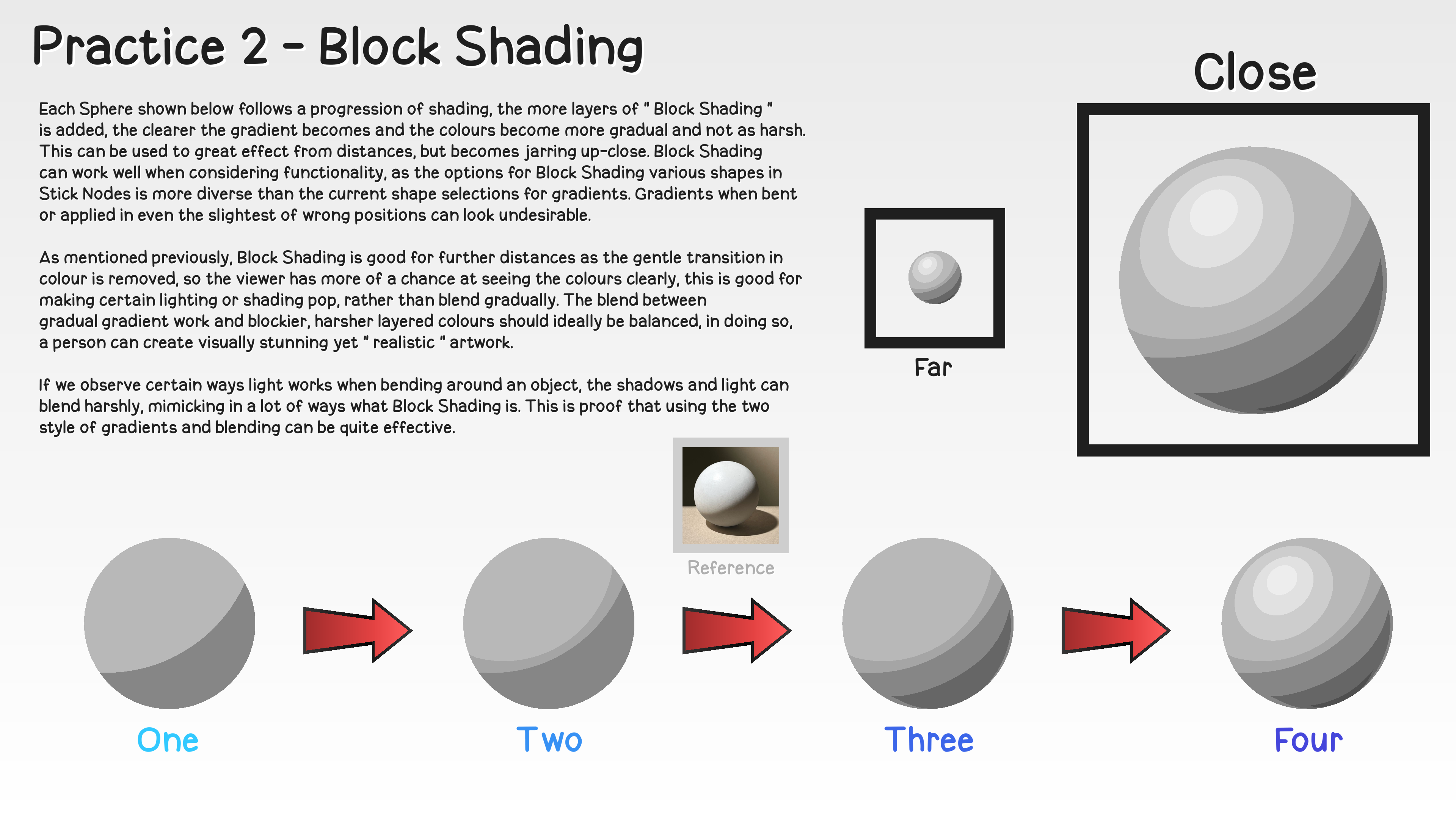
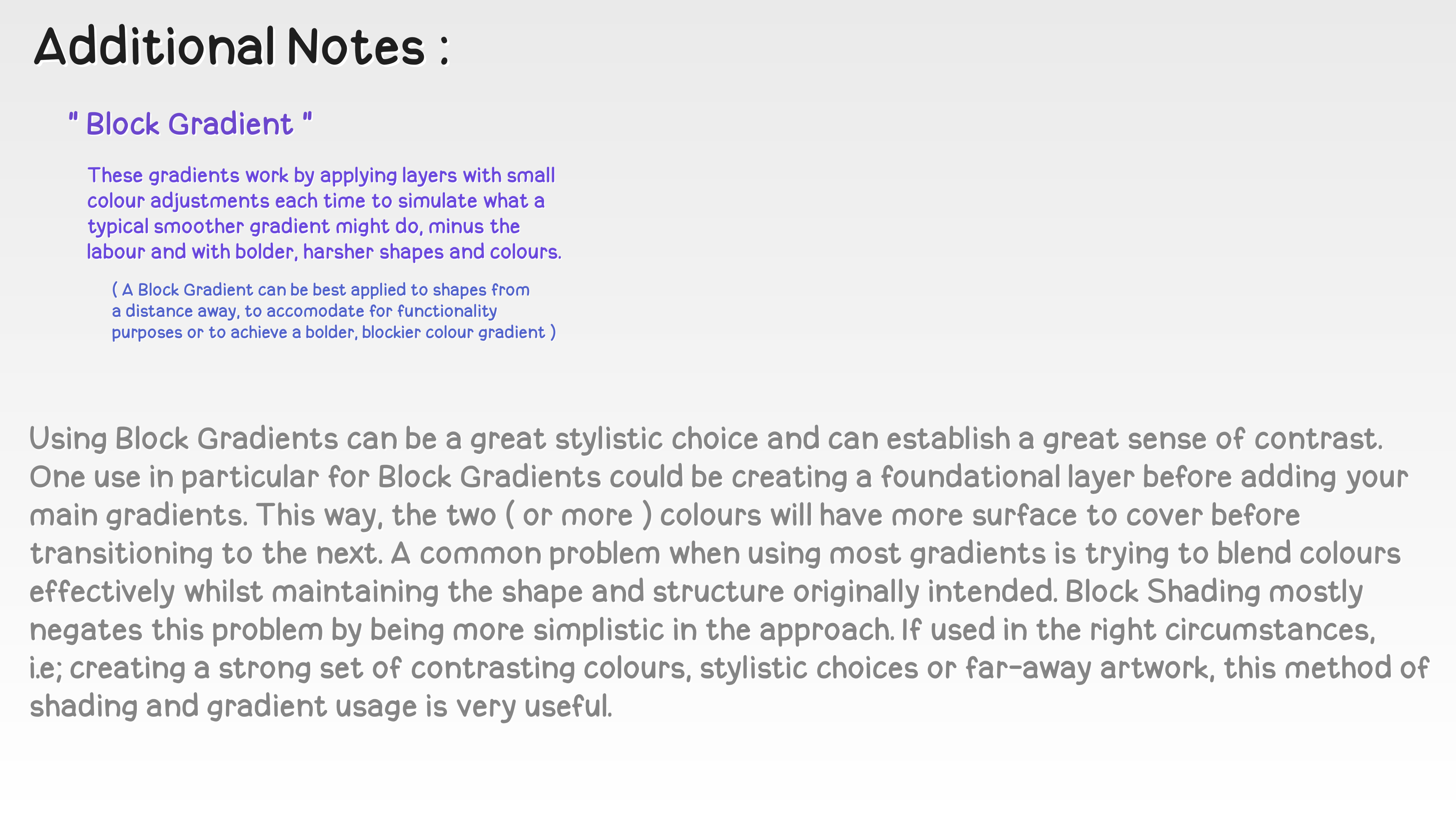
Today I was working with Block Gradients, which are essentially just blockier, layered colours to simulate a gradient. I’ve been writing notes and I thought I’d see if anyone was interested in reading them?
I just want to preface that these notes are written up roughly and then maybe refined before I share them, so if they sound like they’re trying to state facts rather than opinions or if I make any mistakes, that’s just an issue on my part.
If you disagree with anything said or if I’m wrong, you’re welcome to correct me. 💬
Should I share my notes each time I practice something?
- 91%
- 9%
11 votes
Stick Nodes®
A stickfigure animation app created for mobile devices!
Create your own stickman animations on your Android or iOS device!


By the way, all of this informational content will be used when I decide to release tutorial content.
The key difference being that the quality will be far better and more entertaining, and that I will source my information from different people who have the right specialised experience and knowledge. Then compile this information into a useful tutorial video or document for people to use and enjoy.
Ok first of all I absolutely love posts like these. Of course you should post more like this.
Everything you said about block gradients couldnt be more true. Regular gradients are best used to demonstrate soft lighting, just as an airbrush is when you paint. In other words, they’re better for surfaces that aren’t being harshly cut by shadow.
In my own art, ive actually been using harder shadows more often than softer shadows. I think it about just how you think about your layered block gradients. Applying harder brush strokes in multiple shades is much more satisfying to look at, especially from afar.
Most beginners might think that regular gradients, or soft shadows, are more realistic as that is how we picture shadows in our head. The reality is that both exist, but layered hard shadows will always look better. I can see it in my own artwork. It’s really all about confidence. We are often too scared to add hard shadows, as soft shadows are often easier to apply.
Though, the best art comes from the confident artist. Thats something that took me a while to learn, and once I did, I improved greatly. Be confident, add hard shadows, block gradients, and layer them accordingly. Thats my advice to everyone.
Also, you may already know this, but I thought I’d say it anyway for whoever may read this. On the example you showed, add a little reflection light after the darkest shade on the ball. It adds so much more depth and realism in your piece, you can even see it in the reference. This applies to everything, humans, clothes, environments..
Anyways, sorry for the yap lmao
No worries, this is great information. When I was watching your recent video, I realised that you use a lot of block shading so I’m glad to get your insight.