Activity Mellow 2021-08-10 11:03:14 UTC Stick News Network I may have gotten a bit overzealous and made it too wide, but I can fix that
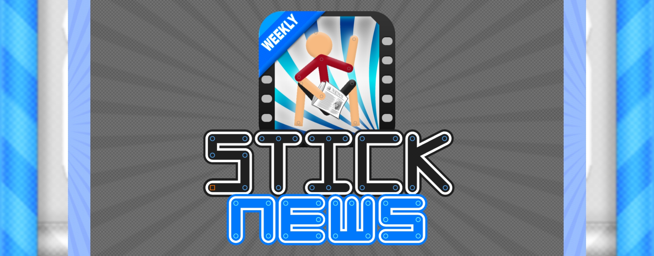
 20 Highway Heretic · 4 years, 10 months ago Nothing can top that 2021-08-10 11:03:47 UTC 3 Mellow · 4 years, 10 months ago Here’s your thinner version 2021-08-10 11:06:32 UTC 10 Mellow · 4 years, 10 months ago Replying to: Mellow Here's your thinner version I couldn’t figure out a way to properly replace the PRO with WEEKLY, so I just opted for the blue strip route 2021-08-10 11:11:17 UTC 1 Mellow · 4 years, 10 months ago Really, the only concept I had was just to not get too crazy. Since this will be a Stick Nodes news outlet, why not go for the Stick Nodes aesthetic? Sometimes, it’s better to keep it simple, and STICK to your roots 2021-08-10 11:08:02 UTC 2 Mellow · 4 years, 9 months ago If this does end up being chosen, maybe the format should follow this same aesthetic 2021-08-10 11:32:16 UTC 1 Mellow · 4 years, 9 months ago I could still make some improvements even now, and I’d be happy to 2021-08-10 12:27:15 UTC 1 Ralph (Developer) · 4 years, 9 months ago 10/10 recreation of the SN logo “font” there with the NEWS lmao @ the newspaper that’s great 2021-08-10 12:41:56 UTC 4 Mellow · 4 years, 9 months ago Replying to: Ralph (Developer)10/10 recreation of the SN logo "font" there with the NEWS I may have cheated and used a Stick Nodes logo stickfig I downloaded from the website, but I mean… it worked out in the end lol Actually, I should see if I could seriously recreate the Stick Nodes font, if I can and when I do I should definitely post it here 2021-08-10 12:50:33 UTC 2 Infiniteguess · 4 years, 9 months ago Wow, this looks great, also hey glad you could make it. 2021-08-10 13:39:01 UTC 3 Mellow · 4 years, 9 months ago Replying to: InfiniteguessWow, this looks great, also hey glad you could make it. Heh, thanks 2021-08-10 14:01:52 UTC 0 Tastylemon16 · 4 years, 9 months ago That’s top notch 2021-08-10 15:02:24 UTC 2
Nothing can top that
Here’s your thinner version
I couldn’t figure out a way to properly replace the PRO with WEEKLY, so I just opted for the blue strip route
Really, the only concept I had was just to not get too crazy. Since this will be a Stick Nodes news outlet, why not go for the Stick Nodes aesthetic? Sometimes, it’s better to keep it simple, and STICK to your roots
If this does end up being chosen, maybe the format should follow this same aesthetic
I could still make some improvements even now, and I’d be happy to
10/10 recreation of the SN logo “font” there with the NEWS
lmao @ the newspaper
that’s great
I may have cheated and used a Stick Nodes logo stickfig I downloaded from the website, but I mean… it worked out in the end lol
Actually, I should see if I could seriously recreate the Stick Nodes font, if I can and when I do I should definitely post it here
Wow, this looks great, also hey glad you could make it.
Heh, thanks
That’s top notch