-

Collo


 2021-10-03 00:16:52 UTC
 Do you think these colors are good or should i tweak them?
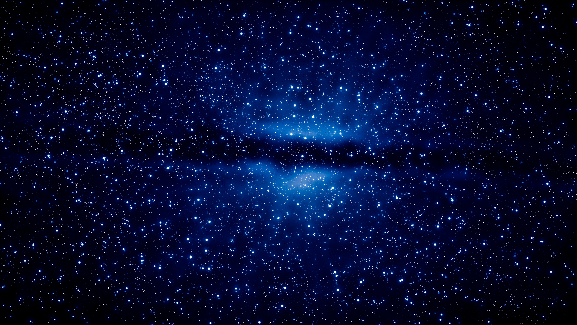
The top image is what the galaxy would appear like to the naked eye.
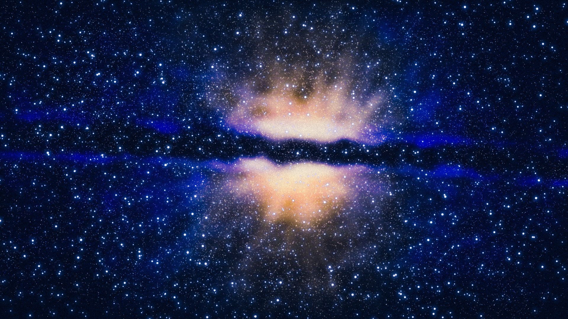
Fairly dim.The bottom image is what the galaxy would look like when exposure is raised.
.
Stick Nodes®
A stickfigure animation app created for mobile devices!
Create your own stickman animations on your Android or iOS device!

Me like
Imagine accidentally leaking information that wasn’t supposed to be seen by the public.
Oh well.
Same
Hard to say, the bottom is more vibrant and noticeable but in backgrounds and whatever you wouldn’t always want profuse colours and whatnot.
I’d say the top.
By the way I think you posted this outside the group lol.
By the way I think you posted this outside the group lol.
I did, i don’t know how i’m starting to do this more often but i guess i’ll have to live with it lmao.
But back to the point, i wasn’t really saying this as a choice but if the colors were good enough in both the vibrant and the dim. But basing off your opinion i guess i should tweak it, thanks.