-
Cektor


 2019-09-07 08:55:45 UTC
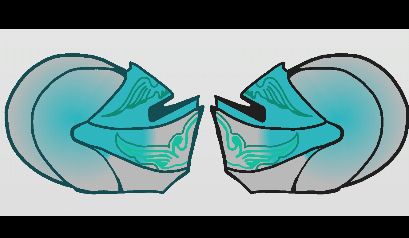
 G’day.
I was wondering if the gradient and coloring for my knight helm used is good(i understand that the colors to the back and front are quite different but when i manage to find the right colour shade i cannot do anything to match it just yet) originally this was meant as just a small texture with an opacity of 75 to give it a some what feintish grey to the corners. Any advice would be grateful,or color change.
(P.S) is it better a darkish cyan or keep it at a darkish grey?
Stick Nodes®
A stickfigure animation app created for mobile devices!
Create your own stickman animations on your Android or iOS device!

Keep it as a solid cyan colour, nothing else.
User Banned
Have it so that the crest on the top is cyan and the top bit of the visor is also cyan
The rest should be that steel silver with no gradient
Also keep the weird pattern, it’s neat