-

Cosmy


 2020-03-19 20:40:16 UTC
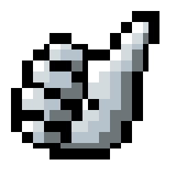
 Lvl 2 – Silver
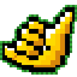
Lvl 3 – Gold
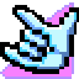
Lvl 4 – Diamond
Stick Nodes®
A stickfigure animation app created for mobile devices!
Create your own stickman animations on your Android or iOS device!
Cosmy 2020-03-19 20:40:16 UTC
Lvl 2 – Silver
Lvl 3 – Gold
Lvl 4 – Diamond

@ralph
Lvl 4 is my favorite.
I kinda like the gold one more than the others
what is this for, I may ask
Ralph wanted us yesterday to create things for the redesign
no I mean what is it for
like what are these symbols meaning
Oh, it’s for your comment level
I think.
Nice
while it’s hella cool… It also seems to lose the pixeliness. Like it has squashed rectangles.
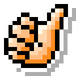
Compare that to currect UC icon.

Idea is definitelly here though I could redo these into “corrected” versions if Ralph decides this idea is good enough.
It’d be great if you could because my editor could t hold any more pixels
Slavic gang sign
wow this is actually really, really good
hopefully i can make it work with the extra colors for the background effects/outline you added but shouldn’t be too bad even if I have to remove that
gonna probs use these, but may change silver somehow bc it just looks like a “bland” lvl1 actually
thanks a lot tho this saved me a lot of time
@arcionek u right about the pixel thing. I’d probably just leave it, mainly because I didn’t keep proper pixel-size/style across all the badge icons over time (I really should redo them all in a uniform style but-) so…
Imma just leave it as is, no need to kill yourself over moving pixels around for an hour, thx tho
I must
you really, really doesn’t-mustn’t
seriously though you don’t
but IF you do, keep in mind (if it matters) I’m gonna probably add a white outline around it to match the other badges (thats why i may have to get rid of the bg effects)
Hm Tbh somehow I didn’t even notice the background stuff. Tho… why not double layer images with one having an outline?
Eh, we’d see I guess lole.