-

Tastylemon16


 2020-12-13 13:05:18 UTC
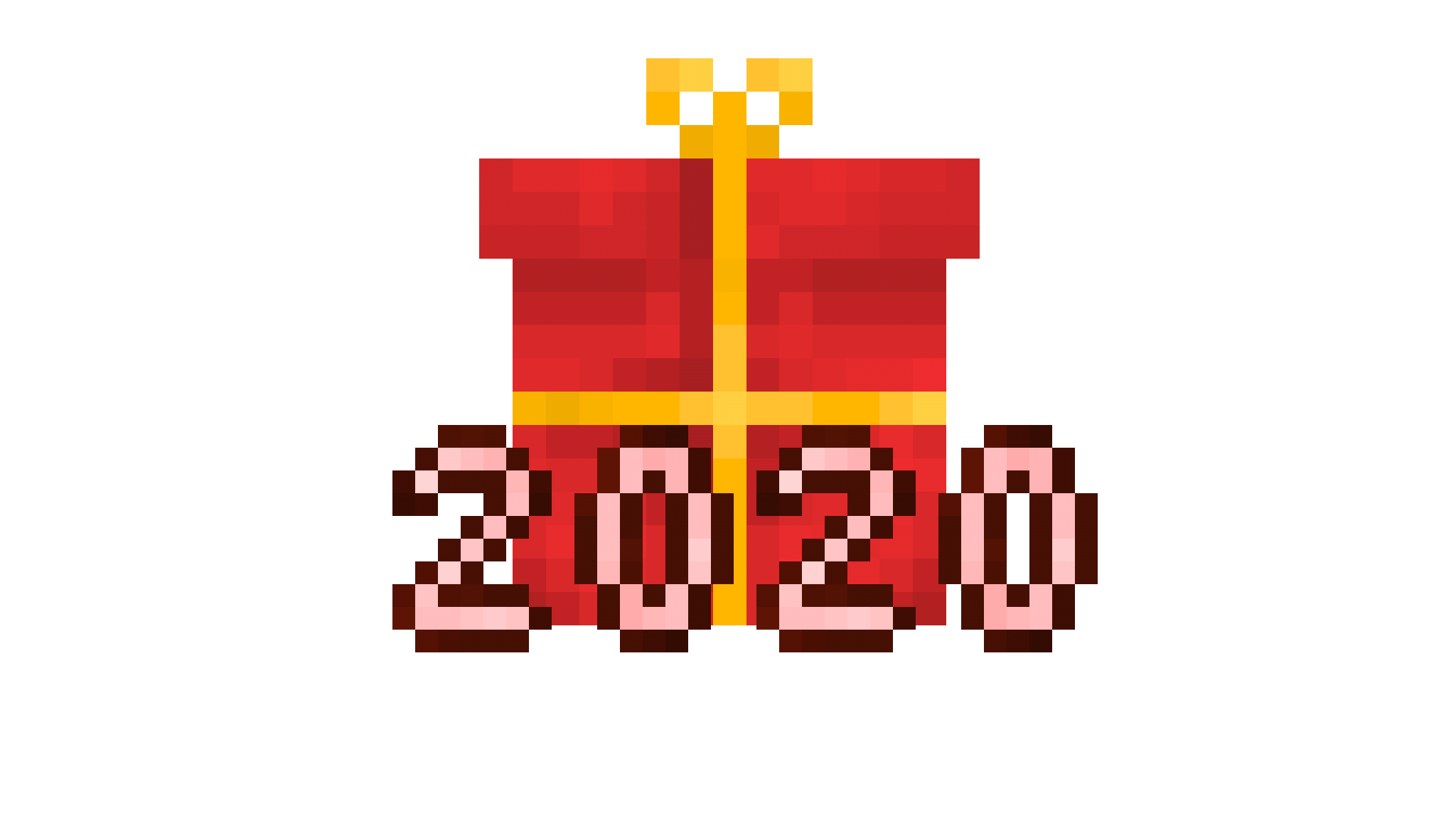
 @ralph would this work or should I make some adjustments, i’m not completely okay with the way the letter looks but if you think they’re up to standard than fine by me.
Stick Nodes®
A stickfigure animation app created for mobile devices!
Create your own stickman animations on your Android or iOS device!

They were way too big so I resized them but the pixels don’t align properly because different sizing although it isn’t very noticeable at least not from a distance which is how you’d see them.
nah that’s actually really nice great job
it’d look good on a green icon BG so perfect color scheme
only thing I would say, and it’s fine bc I can tweak it later but when it’s scaled down to the “small” icon versions, the text outline is probs too thin
so maybe thiccen them up a bit
again I can do it but maybe you wanna tweak it a certain way or something
ps thanks, between this and the mod thing you saved me some time lol
t h i c c
ralph is a milk man.
No worries, i’ll thicken it up a bit.