@gyro


Joined on October 21st, 2017, this user has been a member for 3,148 days and is the 3,482nd person to register an account.
Has 61 submissions, the first one uploaded on December 22nd, 2014 and the most recent on October 1st, 2024.
Of those, 3 have been featured and 12 have won Users' Choice.
On average, each submission earns 3,759 downloads.
In total, they have been download 229,315 times.
Counting every individual stickfigure, including the contents of all packs, this user has technically made and submitted 244 stickfigures.
On average, when this user rates stickfigures, they are 99% positive.
Also, they are typically 100% positive when rating animation spotlights.
Has made 221 comments on non-activity pages of the site. Alternatively, this user has made 3,084 comments on actual activity pages of the site.
This user also has been featured in the Animation Spotlights 2 times.
This member is a Users' Choice voter!
Their current voting streak is 0 and their longest streak is 5 consecutive votes.


-
 Replying to comment by:
-
 Replying to:
3
-
Perma joined the group ![]() Splash Screen Characters 2020 3 years, 9 months ago
Splash Screen Characters 2020 3 years, 9 months ago
The only cool thing you need to show off is the rules to the splashscreen contest so I can enter


Chapter 1 of Team PRPL is available to read!
https://archiveofourown.org/works/40925445/chapters/102560340
-

nice!
2022-08-11 18:11:34 UTC
Basically yeah
@ralph Weird question, would it be cool if I promoted the Team PRPL stuff on my AO3 in this group?
-

i had to look up what that was lol
yeah, i think its okay, its all revolving around your PRPL oc’s which are made in SN
the PRPL peeps made in SN look amazing, and I assume the AO3 stuff is just the lore and whatnot?
2022-08-10 11:49:50 UTC-
Replying to:
Basically yeah
2022-08-10 13:49:27 UTC-
Replying to:
bet then
2022-08-11 11:33:11 UTC
1. I don’t sketch my figures before hand. Usually I think up a design in my head and search the internet for references for that design. Hair styles, clothing and the like. In rare cases I look up a color palette, but I usually just eye-ball that stuff.
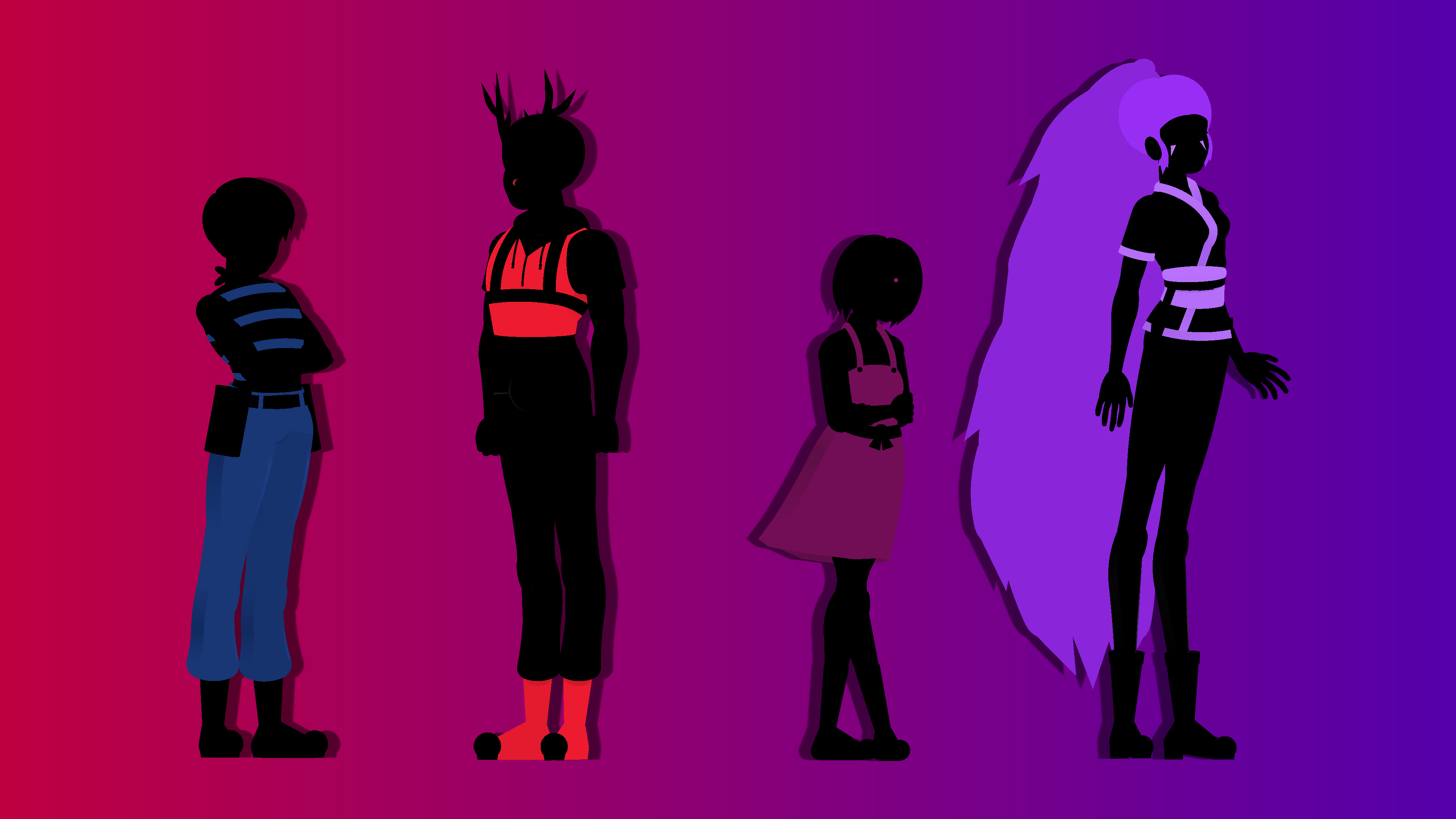
If the character is from a line of other characters then I line up those figures in the animation window before going into figure creation. Helps give reference for height and proportions since I want the characters to look good together. Creating a line of figures is good for character design too. A “tall” character is only as tall as other characters are short I’d say.
2. My figures are a bit unconventional, but tips from the process for my quarter views are as following.
Everything starts with a half ellipse. This forms the hips, and the rest of the body (including the legs!) are attached to it. Then you can build the torso by offsetting a rounded node. Real easy way to create perspective and an even easier way to make a front view later by centering the rounded segment.
Before I move onto details, I make sure the general shape of the figure looks right from both sides. Flipping your creation before you detail it is a good habit to form, as something that looks fine from one angle might look off from another. Once I’m satisfied with how it looks from both sides I move onto colors.
Darker colors and shaded areas should be more saturated! Bright colors can be lightened even further via desaturation! I picked this up from JackFly. Things in shade are more appealing when it’s slightly more saturated than the brights. And if you want to make a highlight on an already bright color, than desaturation can achieve that effect. As a side note, try slightly tinting the blacks and whites in your designs. This can add warmth or coldness to a design, and in my opinion, add more color harmony.
Adding creases can help detail clothing. I’m no rendering expert by any means. But adding a few creases in areas that bend a lot can help make your clothing look more like clothing and less like spray paint. Just a couple of ellipses in front or behind the elbow, the back of the knee, or the middle torso can make the fabric more real.
Shade the neck and the back of the head so you can model a jawline. I started doing this way before I did quarter views figures, and it helped a lot with defining my heads. Another tip is feminine jaws are soft and round while masculine jaws are straighter. Do what’s best for your character and get creative!
ADD A HIGHLIGHT TO YOUR PUPILS! Seriously, it adds so much life to my eyes. You’d have to see yourself to recognize how much of a difference a single white circle node can make to an eye. Doesn’t even have to be a circle either. If your character is more serious, maybe the circle can be replaced with a triangle. If they’re cutesy, you can add a bunch of circles. Hell, maybe your characters eyes are supposed to be lifeless, and in that case don’t add a highlight at all. Little details can make all the difference, and the eyes are the center of the face, so be unique with them!
And lastly
Quarters front, side, and quarters back views are enough for a decent turnaround. Obviously the addition of straight front and back views are preferable, but the three I mentioned are enough to make your character turn around convincingly, at least at higher frame rates.
A lot more I could go into, but this is pretty long already. Hope it helps!

2