@sectorkm9


Joined on December 24th, 2017, this user has been a member for 3,085 days and is the 5,141st person to register an account.
Has 25 submissions, the first one uploaded on January 2nd, 2018 and the most recent on February 15th, 2024.
Of those, 0 have been featured and 6 have won Users' Choice.
On average, each submission earns 1,352 downloads.
In total, they have been download 33,800 times.
Counting every individual stickfigure, including the contents of all packs, this user has technically made and submitted 101 stickfigures.
On average, when this user rates stickfigures, they are 98% positive.
Has made 15 comments on non-activity pages of the site. Alternatively, this user has made 219 comments on actual activity pages of the site.
This member is not a Users' Choice voter.
Show More


-
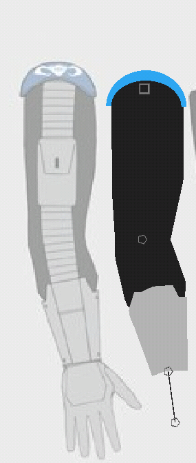
Damn. I have not been in this website for a long time. So what better than to create a new figure with a different technique and to ask for some help eh?
So I want to ask on what places would be best for the usage of gradient colours. And while we’re at it, is there anything else that should be added (avoiding the details as it’s still a wip).
P.s
The arm is a tad bit wonky but i will have that fixed soon enough.
-
 Replying to comment by:
Thanks. I never understood on knight engraving tbh they\’re too weird at times
-
G’day,
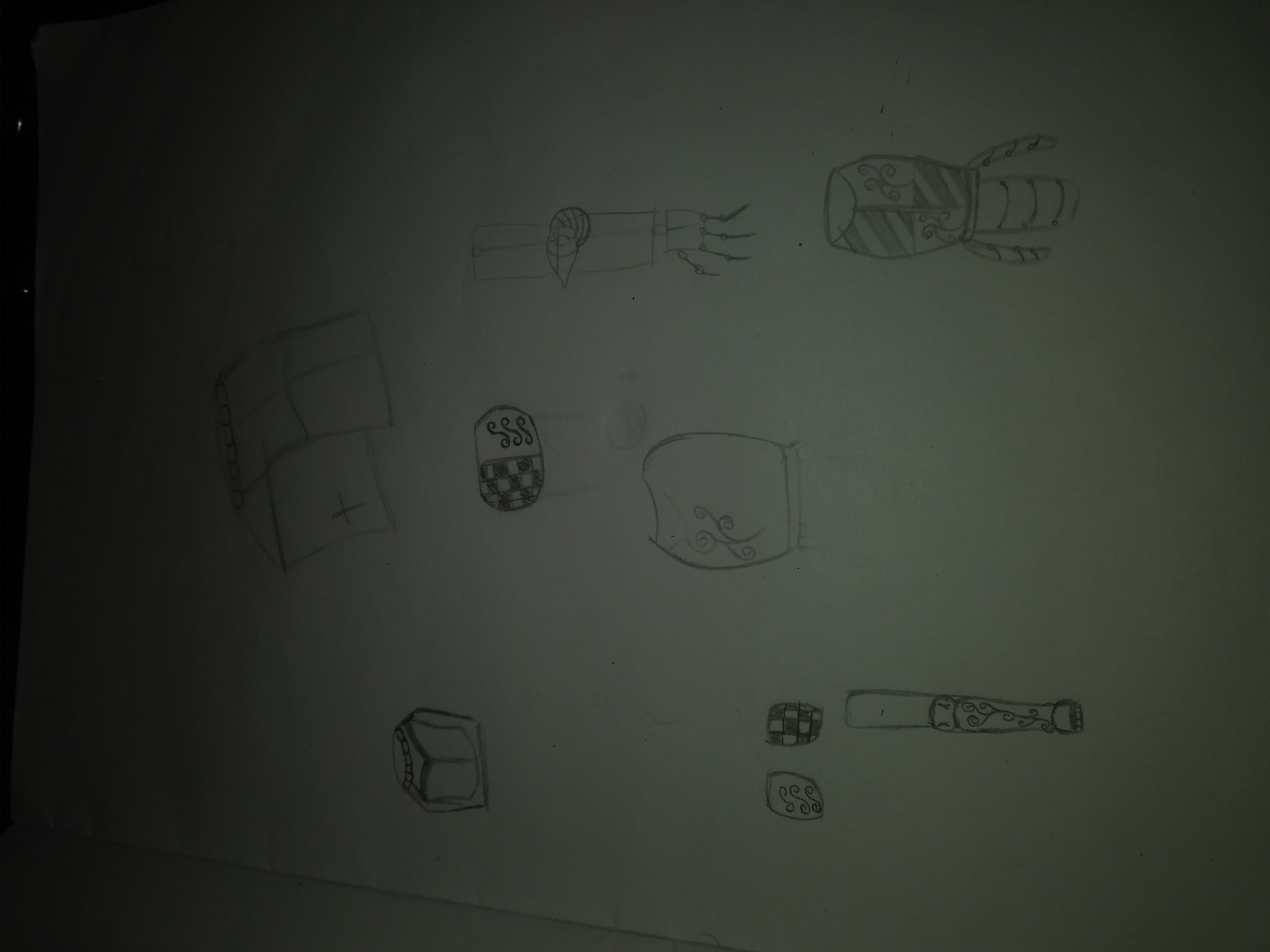
I was wondering if this sketch of some pieces of knight armor is alright? I tried to skecth them by head but i have gotten some flaws.
(P.S, if anyone knows the name of what type of helmet it is that I drew I would appreciate it as im trying to remember how it looked.)
-

looks like crusading time
im not an armor connoisseur like it appears half of the people here are so not sure what much of this is besides the leg/helmet stuff
good touch with the swirly-swirl designs, that’s very knight-ish
2019-10-19 22:33:49 UTC-
Replying to:
Thanks. I never understood on knight engraving tbh they’re too weird at times
-
-
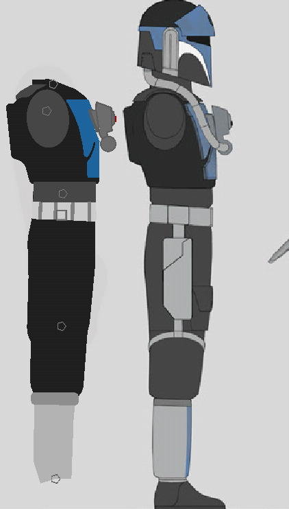
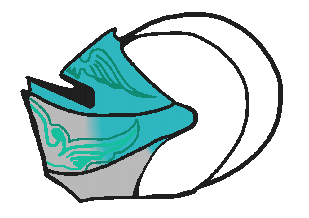
G’day.
I was wondering if the gradient and coloring for my knight helm used is good(i understand that the colors to the back and front are quite different but when i manage to find the right colour shade i cannot do anything to match it just yet) originally this was meant as just a small texture with an opacity of 75 to give it a some what feintish grey to the corners. Any advice would be grateful,or color change.
(P.S) is it better a darkish cyan or keep it at a darkish grey?
-

Keep it as a solid cyan colour, nothing else.
-

User Banned
Have it so that the crest on the top is cyan and the top bit of the visor is also cyan
The rest should be that steel silver with no gradient
Also keep the weird pattern, it’s neat
-
Replying to comment by:
What should i do to improve it?
-
G’day.
I just popped back into sticknodes recently and was looking through a lot of unfinished things. I decided to try and finish the knight helm i was so long doing and just wanted to see if the coloring and gradients use is alright.
-

No, it just looks good but isn’t at all right
2019-06-08 01:41:08 UTC-
Replying to:
What should i do to improve it?
-
-
Replying to comment by:
I mean my intention for the second was so the hood had a moveable tail you know,like those mediaeval fantasy games where the hood isnt like the actual one in real life but i kinda fix that by adding a mixture of a real life helmet,whilst the first one though,i dont like it myself as it looks too bland and the head looks as if its too big.
-
Replying to comment by:
Its actually from peacekeeper from for honor but male and fem version aswell as from a real knight helmet combined with a hood. But i can see where you are sayin that it kind of looks like that mask.
-
Replying to comment by:
((My bad for it being tilted that way))
-
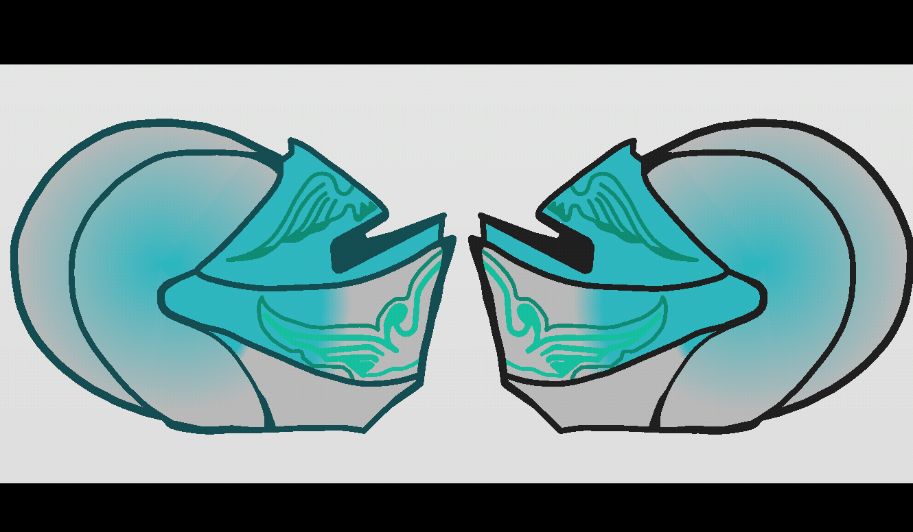
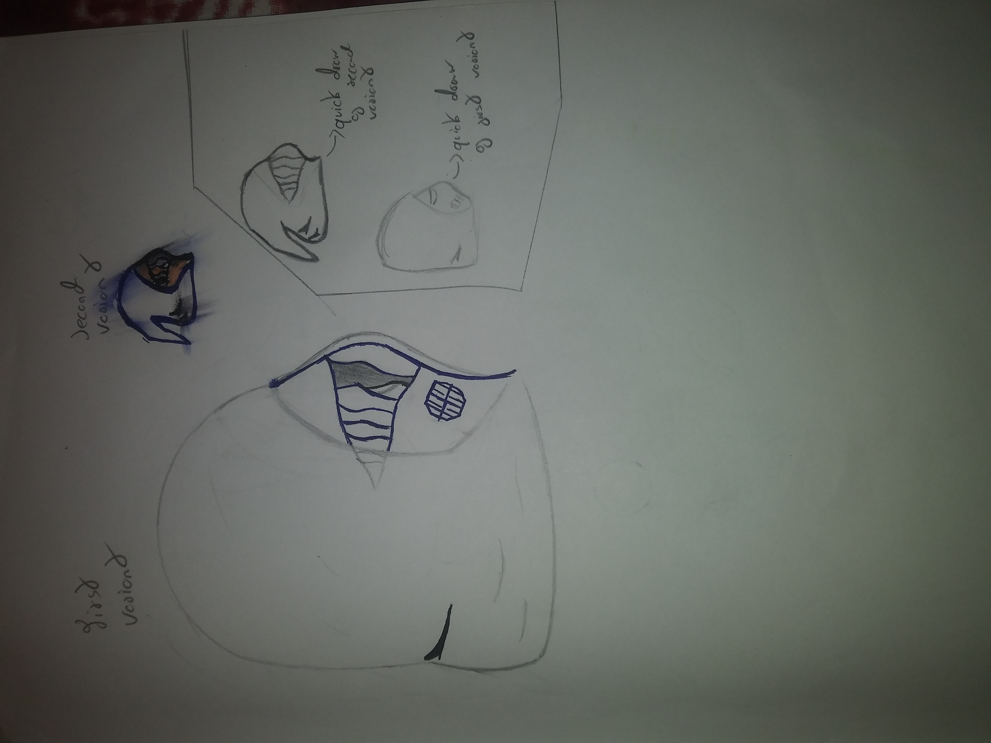
G’day.
Was wondering on how this drawing looks like and if i should try to make it into a helmet. Also choose which one variant i should make whilst i try to improve on the least voted one.(Sorry for the smudges on the second variant,the pen i use is crappy and i have to wait for it to dry out but forgot.)
-
((My bad for it being tilted that way))
-
Replying to:
its correct orientation for most people, there’s a certain browser/os combination that poops itself unfortunately 🙁
-
-

First version
-

Lookin like kilo ren’s mask
-
Replying to:
Its actually from peacekeeper from for honor but male and fem version aswell as from a real knight helmet combined with a hood. But i can see where you are sayin that it kind of looks like that mask.
-
-
first version looks more solid and helmet-y, but i like the idea of the second one being a useable hood for any figure
-
Replying to:
I mean my intention for the second was so the hood had a moveable tail you know,like those mediaeval fantasy games where the hood isnt like the actual one in real life but i kinda fix that by adding a mixture of a real life helmet,whilst the first one though,i dont like it myself as it looks too bland and the head looks as if its too big.
-
-
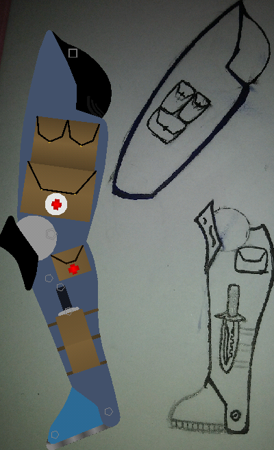
G’day.
I have finished the leg of a figure i am thinking of doing and this is the final details i have added to it,this is my second time creating a fig without tracing it so i do apologize in advance if it is incredibly choppy at some parts or if it does not have enough gradients.
(Though feel more than free to point out on them and or even tell me what can be improved on and i will attempt to fix it.)
-
that’s one sexy leg
2019-03-14 22:46:09 UTC-
 Replying to:
Juicy
-

You also draw things and then trace them? Nice.
-
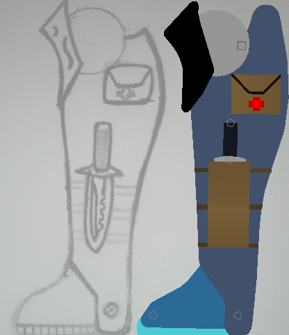
G’day.
May i get a suggestion on the leg if a fig i am creating. (Its also my second time trying to make a fig without outlines so sorry if it’s quite choppy and weird,though if you lot think its a massive problem I’ll try to fix it the best i can).
-
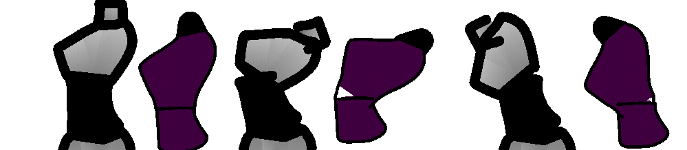
G’day. I was checking on a old stickfigure i made and desided to see if i could improve it as it was kinda choppy and couldn’t move most of the body and made a 2.0 torso-Remember,its only a test and so some parts wont be colored purple or the outline might go under or over the purple-Hope you guys think its atleast an improvement to the old version.
(Old one is grey the new one is purple)
-
Replying to comment by:
And i just re-read your comment and this time i saw the quotation marks so i guess the joke flew right past my head
-
Replying to comment by:
Didnt saw it in that way coming to think bout it now
- Load More


This man be like when i came back but hes actually good at making figs