@arcionek


Joined on August 18th, 2017, this user has been a member for 3,221 days and is the 1,949th person to register an account.
Has 13 submissions, the first one uploaded on December 14th, 2016 and the most recent on May 31st, 2019.
Of those, 1 has been featured and 6 have won Users' Choice.
On average, each submission earns 5,409 downloads.
In total, they have been download 75,735 times.
Counting every individual stickfigure, including the contents of all packs, this user has technically made and submitted 52 stickfigures.
On average, when this user rates stickfigures, they are 87% positive.
Also, they are typically 78% positive when rating animation spotlights.
Has made 1,049 comments on non-activity pages of the site. Alternatively, this user has made 12,151 comments on actual activity pages of the site.
They have visited the site consecutively for 1 day, their best streak being 125 days. On average, they post 1 update and 2 comments per week.
This member is a Users' Choice voter!
Their current voting streak is 0 and their longest streak is 27 consecutive votes.
 Arc gaming reviewsOwner
 Rigging Nerd ClubOwner
 ????????????????????????????????????????????????????????????????????????????????????????????????????Owner
- Temp group will deleteOwner
 Stickfigure Starter KitOwner
 Stick Nodes Beta TestersOwner
 No girls allowedOwner
 Sticknodes ModdersOwner
 Mod Talkadmin
 #TeamArcionekadmin
 Admin Talkadmin


-
 Replying to comment by:
@ you under the thing I want you check.
The shit is clunky af and horrid for mobile users. That’s what I’ve been trying to tackle. My point with “top bar having wasted space” was to just show one of potential options lol.
And I don’t really mind having a total overhaul. If you try to go ease into things slowly, you just end up with half-assed ui that didn’t expect any new tools. It’s the 4.0.0 view options problem.
The problem wasn’t the top bar. It was whole workflow layout in general.
-
Replying to comment by:
Do not show button in 4.0.0 was Ralph’s own idea. Mine was thinking about doing that with the whole ui rework… But man just went “alright I gotchu” and just went with that lmao.
Also the UI is pretty broken, you just said it yourself. It’s clunky, especially for phones and throws new users away. Which was the point I’ve been trying to tackle with redesign.
But @Ralph missed the point and just went “oh the top wastes a lot of space alr” and made a b-17 cockpit lookalike, making the exact problem I’ve been working on twice as bad 💀
-
Replying to comment by:
People went mad about it because it was just unneeded change, dicking them out without rhyme or reason. Not even 5$ note with a note thanking for good time.
People are bad because it is half-assed change that didn’t really needed to be done.
-
Replying to comment by:
Wtf are chrome books even cause I dont even know. Are they just tablets with built in physical keyboards or smth?
-
Replying to comment by:
Yes I am in fact confident about the tool belt lol. You wanna make more Segments? Boom. Draw mode, got all the segments ready at the thumb and quickly make basic edit to them.
And I don’t really want to go halfway into changing the UI just for the sake of users being used to it. It’s fundamentally bad and I just went to rework it nearly from scratch.
-
Replying to comment by:
Are you asking it like it’s been already here or asking for the future update?
One time it unintentionally worked and you’d crash each time you tabbed back in so
-
It’s time to rat

-
Replying to comment by:
question, are you a tablet user
-
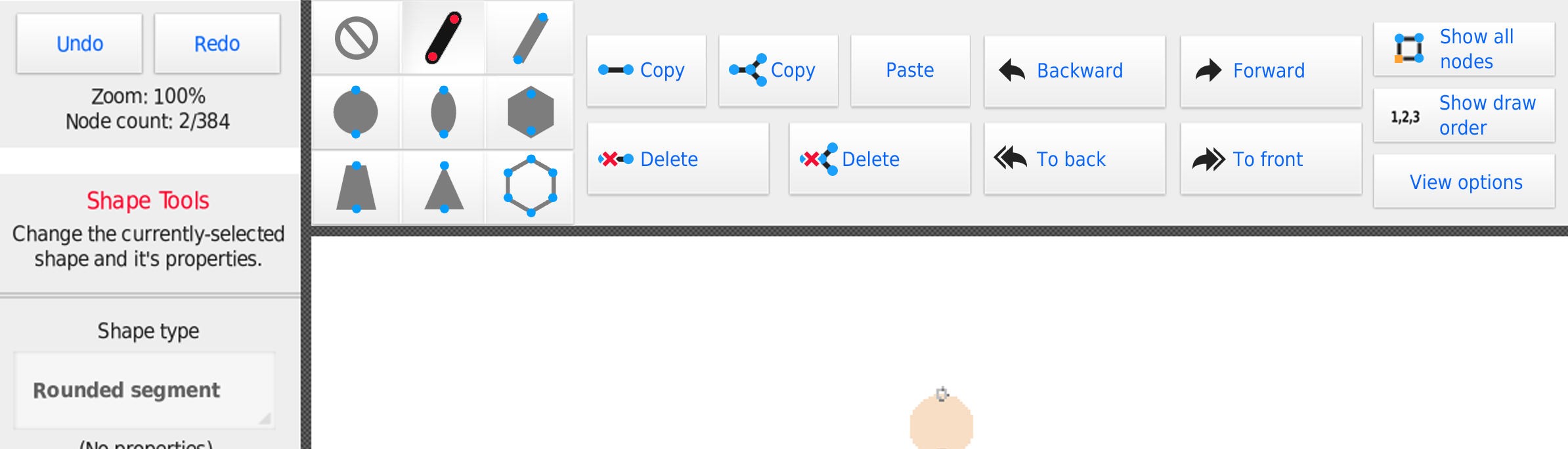
Replying to comment by:
it was referring to the \”View Options\” being the only thing in the creation menu, taking away the \”Show all nodes\” and \”Show draw order\” into it. Making that change without much reason is pretty bad ngl lmao.
-
Replying to comment by:
oh yea that\’s a bug, it should be fixed in 4.0.2
-
Replying to comment by:
i geniuenly wanted to show it off in a better way, but ralph really doubled down and posted his abomination lmao.
meanwhile my arse already busting with ongoing collab.
-
New sidebar dropped

-

Why did my brain automatically think those joysticks were Valve Index controllers
2023-07-13 08:23:07 UTC -

serious question
you don’t like the top bar as it is now because its wasted space
as soon as a few very neat and organized buttons are added, it becomes too cluttered
does your mother know that you are gay
2023-07-13 11:31:09 UTC
-
Replying to comment by:
and now just a gentle lovetap with @\’s to make everyone switch teams…
@demonic @lonew0lfops @milkymurderer
also to get some other\’s opinions again.
@yolojoethebro347 @jack @redtheanimator @squidoanimations @ralph -
Replying to comment by:
the node selection is honestly an abomination. Like… It breaks every single ui rule he had made so far.
Buttons touching the edges of ui. Buttons actually touching (only exception are the Mode buttons). and so on…
while at first it sounds neat… the more you actually think about it the worse it gets lmao.
-
Replying to comment by:
I think Ralph is the one who should remember phone users exist
- Load More

they really have a stock image of everything
i rate this post 10/10 rats