@arcionek


Joined on August 18th, 2017, this user has been a member for 3,221 days and is the 1,949th person to register an account.
Has 13 submissions, the first one uploaded on December 14th, 2016 and the most recent on May 31st, 2019.
Of those, 1 has been featured and 6 have won Users' Choice.
On average, each submission earns 5,409 downloads.
In total, they have been download 75,735 times.
Counting every individual stickfigure, including the contents of all packs, this user has technically made and submitted 52 stickfigures.
On average, when this user rates stickfigures, they are 87% positive.
Also, they are typically 78% positive when rating animation spotlights.
Has made 1,049 comments on non-activity pages of the site. Alternatively, this user has made 12,151 comments on actual activity pages of the site.
They have visited the site consecutively for 1 day, their best streak being 125 days. On average, they post 1 update and 2 comments per week.
This member is a Users' Choice voter!
Their current voting streak is 0 and their longest streak is 27 consecutive votes.
 Arc gaming reviewsOwner
 Rigging Nerd ClubOwner
 ????????????????????????????????????????????????????????????????????????????????????????????????????Owner
- Temp group will deleteOwner
 Stickfigure Starter KitOwner
 Stick Nodes Beta TestersOwner
 No girls allowedOwner
 Sticknodes ModdersOwner
 Mod Talkadmin
 #TeamArcionekadmin
 Admin Talkadmin


-
 Replying to comment by:
Something about iphones not being able to see the play button. And also because it’s redundant to have essentially a context menu for copying and also a copy button at the same time.
I don’t like this idea either lmao.
-
Replying to comment by:
Man you people always hate change lmao. If its something we’d go for, it’s a pain in the dick to maintain multiple versions of same thing. Not to mention settings clutter. That’s why I prefer to just ask what people think and then commit.
It’s a random ass idea. But the reasoning behind is that a lot of times people just get rid of QRT in general because well… It gets in the way. And the fact it is dependent on the position of the segment, causes some annoying behaviour too (main example is tapping rotation button 3 times on a small, zoomed in screen). And then sometimes people just don’t want to it use it for the time being, but toggling it back on is pain in the dick and it’s just faster to scroll.
So then to tackle this problem I need to:
– Put QRT away from the center of action
– Make it in a static position
– Have a way to quickly hide and open it, in goals of being more comfortable than scrolling.
– Adapt it to different screen sizes.Aaaand ended up with this idea. Don’t worry I ain’t Ralph that just changes vital ui element without mentioning it to anyone and be in the belief people just hate change in general.

I hope he backs down on this, it’s View Tools drama all over again. -
Replying to comment by:
Quick Resize Tools.
The icons you can see in the pics lmao
-
Replying to comment by:


-
Replying to comment by:
Ps Ralph thinks its better to make a floating window with the X button and drag points. Imagine.
-
Random ass idea pulled out of… well… my ass.
QRT replacement. Quickly Hide/Open (there’d be a toggle to disable it entirely still). Drag to lock it to any side. Turns into a 2 icon wide layout if screen is smaller.


How terrible is this
- 25%
- 50%
- 25%
16 votes -
Replying to comment by:
Reminds me of my old OC i made that threw a bunch of boomerang knives.
Boomerang knives. Think about it for a second.
-
Replying to comment by:
It does that after export sometimes. Should get fixed after 5 seconds tho.
-
Replying to comment by:
rewatch my video in it’s entirety in case you missed out something… You know… Just in case 😉
-
Replying to comment by:
the way they intently stare into each other’s eyes, as one kabedon’s another
Before giving him a knuckle sandwich
-
Replying to comment by:
My argument after Gigan tells me to shut up
-
Replying to comment by:
That is more of a animation menu side of things, but i get you. It’s horrid af and im struggling with that in my current rig. Will definitely put that in consideration later.
Btw, in 4.0.0 we introduced a thing that when you scroll down to the joined figures, you can click on the name to switch selection to that stickfigure. It was my suggestion. You’re welcome.
-
Replying to comment by:
I sure love how flawless the stick nodes as an app is and there’s not a single issue with its workflow process in any way

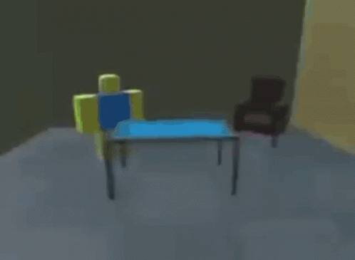
In this gif I’m trying to get to the segment underneath two other, both top and bottom. -
Replying to comment by:
its just a poll about extra feature (one button) not ui revamp lol
-
Replying to comment by:
bonus gif

- Load More


Ps Ralph thinks its better to make a floating window with the X button and drag points. Imagine.
you made this look more confusing than it is because of the 4 images all mashed up
just put one and put others in comments you’re gonna make ppls eyes glaze over
what does qrt mean
Quick Resize Tools.
The icons you can see in the pics lmao
never heard of them
I don’t think I have ever used quick resize tools.
because they’re positioned stupidly
Probably more to do with the fact that I just have grown used to dealing with perfect numbers for this stuff. Using buttons just feels more intuitive to me and more accurate.
Why can’t they just stay hovering near the nodes?
That option was pretty intuitive, if you do make this please add an option to revert back to the old QRT selection
Man you people always hate change lmao. If its something we’d go for, it’s a pain in the dick to maintain multiple versions of same thing. Not to mention settings clutter. That’s why I prefer to just ask what people think and then commit.
It’s a random ass idea. But the reasoning behind is that a lot of times people just get rid of QRT in general because well… It gets in the way. And the fact it is dependent on the position of the segment, causes some annoying behaviour too (main example is tapping rotation button 3 times on a small, zoomed in screen). And then sometimes people just don’t want to it use it for the time being, but toggling it back on is pain in the dick and it’s just faster to scroll.
So then to tackle this problem I need to:
– Put QRT away from the center of action
– Make it in a static position
– Have a way to quickly hide and open it, in goals of being more comfortable than scrolling.
– Adapt it to different screen sizes.
Aaaand ended up with this idea. Don’t worry I ain’t Ralph that just changes vital ui element without mentioning it to anyone and be in the belief people just hate change in general.

I hope he backs down on this, it’s View Tools drama all over again.
What the fuck is this, is the photo you sent Ralph’s doing?
Why would he move the copy button?
Something about iphones not being able to see the play button. And also because it’s redundant to have essentially a context menu for copying and also a copy button at the same time.
I don’t like this idea either lmao.
I’m slowly starting to hate phones
because the context menu on all frames already has the copy button
and it allows for more room for the play button, for the curved edges of phones
as arcionek so helpfully stated…
but im going to make this an optional toggle in App Settings, and all new installations will be set to this by default since its superior to how it is now with reduced redundancy and better view/tappability of Play button