@beginninganimator


Joined on October 4th, 2019, this user has been a member for 2,457 days and is the 26,591st person to register an account.
Has 35 submissions, the first one uploaded on October 9th, 2019 and the most recent on June 16th, 2023.
Of those, 12 have been featured and 24 have won Users' Choice.
On average, each submission earns 5,671 downloads.
In total, they have been download 198,491 times.
Counting every individual stickfigure, including the contents of all packs, this user has technically made and submitted 210 stickfigures.
On average, when this user rates stickfigures, they are 94% positive.
Also, they are typically 100% positive when rating animation spotlights.
Has made 546 comments on non-activity pages of the site. Alternatively, this user has made 14,977 comments on actual activity pages of the site.
This member is not a Users' Choice voter.
Show More D.O.H.D | Development of Hyper-realism Dynamics.Owner
 THE NODIUM | ?Owner
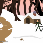 Beauty Is Everywhere - StickFigure Request.Owner
 𝗦.𝗡.𝗨 – 𝗣𝗿𝗲 𝗝𝘂𝗹𝘆 𝟮𝟬𝟮𝟮 𝗗𝗮𝘁𝗮𝗯𝗮𝘀𝗲 🚫 [ ᴏᴜᴛᴅᴀᴛᴇᴅ ɢʀᴏᴜᴘ ] 🚫admin
 Quesoadmin
 #TeamDemonadmin
 Rene’s Groupadmin
 StickNodes Movies!admin
 Big Black Man (changed title cause the original was unbearably cringe, still a dead group tho.)admin
 Africa Campaignadmin
 The Cat Cultadmin
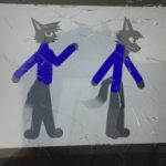 The role play groupadmin
 The Jayingee Youtube Fan Groupadmin
 Flamingo YouTube Fan group./Flamingo memesadmin
 Achlon Theatermod
 The Profile Rankersmod
- OCs Battlesmod
 Cold weather peepsmod
 Chill Boismod


-
 Replying to comment by:
But that’s not the point.
-
Hey guys, you know copoctatius and all that stuff?
I’ve decided i want to turn it into a concept similar to the kaiju universe except on a much more immensely powerful scale.
Put my oc in a universe similar to kaiju?
- 75%
- 25%
- 0%
4 votes -
@k-zilla i’m on the verge of brain decomposition from making this, but i’m getting there.
Wanted to know if you’re fine with this purple design.
===================================
-

Eggplant
2021-10-03 22:53:06 UTC -

I’m good with it.
2021-10-04 00:16:39 UTC
-
Replying to comment by:
Well that just sucks doesn\’t it.
-
Replying to comment by:
FIFA
-
Replying to comment by:
By the way I think you posted this outside the group lol.
I did, i don\’t know how i\’m starting to do this more often but i guess i\’ll have to live with it lmao.
But back to the point, i wasn\’t really saying this as a choice but if the colors were good enough in both the vibrant and the dim. But basing off your opinion i guess i should tweak it, thanks.
-
Replying to comment by:
Imagine accidentally leaking information that wasn\’t supposed to be seen by the public.
Oh well.
-
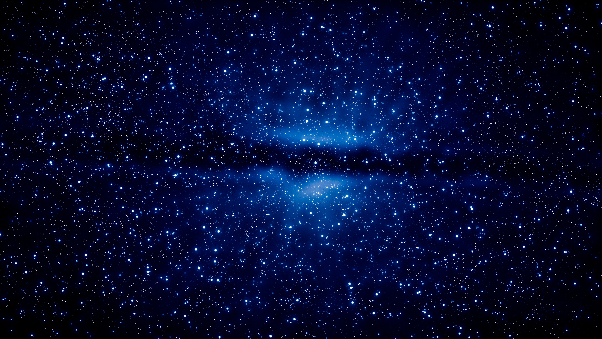
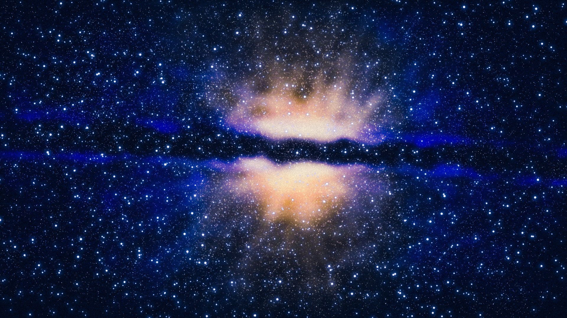
Do you think these colors are good or should i tweak them?
The top image is what the galaxy would appear like to the naked eye.
Fairly dim.The bottom image is what the galaxy would look like when exposure is raised.
.
-

Me like
2021-10-03 00:19:33 UTC-
Replying to:
Imagine accidentally leaking information that wasn’t supposed to be seen by the public.
Oh well.
2021-10-03 00:21:56 UTC -
 Replying to:
Same
2021-10-03 00:22:10 UTC
-

Hard to say, the bottom is more vibrant and noticeable but in backgrounds and whatever you wouldn’t always want profuse colours and whatnot.
I’d say the top.
By the way I think you posted this outside the group lol.
2021-10-03 00:21:44 UTC-
Replying to:
By the way I think you posted this outside the group lol.
I did, i don’t know how i’m starting to do this more often but i guess i’ll have to live with it lmao.
But back to the point, i wasn’t really saying this as a choice but if the colors were good enough in both the vibrant and the dim. But basing off your opinion i guess i should tweak it, thanks.
2021-10-03 00:25:00 UTC
-
Replying to comment by:
They will be, they aren\’t added yet.
-
@stick-animation-zone sorry for the homework sized post, its the best could do.
Images are all the way down.so first, you wanna give it a blur somewhere between 0.05-0.10.
Then you may or may not want to tint it, i’m going to do so because i’m making the background a nostalgic blue (for me).
Next you wanna duplicate it, then put the new figure behind. Tint it to 1.00 with a black/dark color, then blur it and bring down the opacity to an extent that looks good.
This can work as both a shadow on the stick and a shadow behind the stick so just do whatever with that. Or just do both.
Now if you want to add a light, i made a movieclip called “star light” and its mean’t to create a thingamajing of light. This thing is very powerful, and it took a lot of tweaking to adjust to my liking.
So lets say he’s holding a torch, i’m gonna use this as the light for the torch. Gonna blur it to 0.65 to smooth it out and put its opacity on a scale between 0.20-0.50. Gonna give it some tint to an orange color. Then i’m gonna put a white one under the orange one, make it smaller and stuff.
You’re now gonna tell the blue-tint to fuck off and then tint the figure to an orange color since that’s the color of the fire on the torch. And that’s it.
If you wanna improve the look of it i use something called photoshop express, i’m gonna use the charm 4 filter because it looks noice out of most of them.
There are many other things to learn but that’s to be documented in the future.
image 1 = nothing
image 2 = after shading
image 3 = charm 4 filter


-

Thank you so much this tutorial helped a lot
2021-10-01 22:40:31 UTC
-
Replying to comment by:
why are these images making me naseous
-
Replying to comment by:
Meh, you should some of the intestines. Those are the best parts.
-
Replying to comment by:
me when leatherface
-
Replying to comment by:
It\’s 5:12 PM where i am
-
Replying to comment by:
pro gamer moves
- Load More


